
The Theory of Banking Logo Design
22.05.17
At Brandcraft, we help some of the world's major banks and finance houses stay on brand. Today, we're looking at why branding in banking is so important and what conventions are employed in the sector

Banks must translate feelings of security and trust to their customers. One of the most important ways that they can do this is inherent in the design of the logo.
A bank’s identity must inspire trust, security, strength, but most importantly it has to be in the long-term. Branding should never be considered in the short-term, and banks are the perfect example of an industry that must look to create and germinate the feeling of confidence forward of five, ten, twenty years. This is why the creation, or rebranding of an emblem with so much meaning, social value (which are often subconscious emotional values), should be deeply considered and understood.
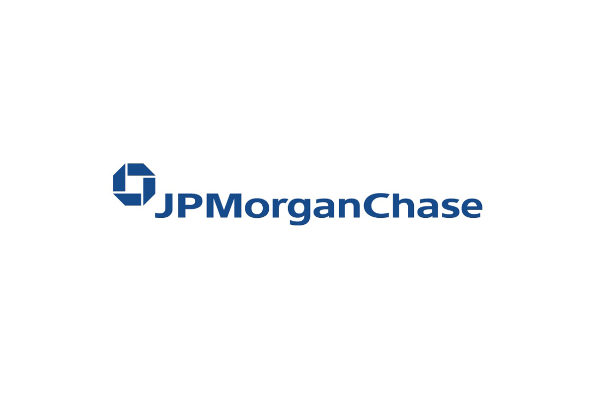
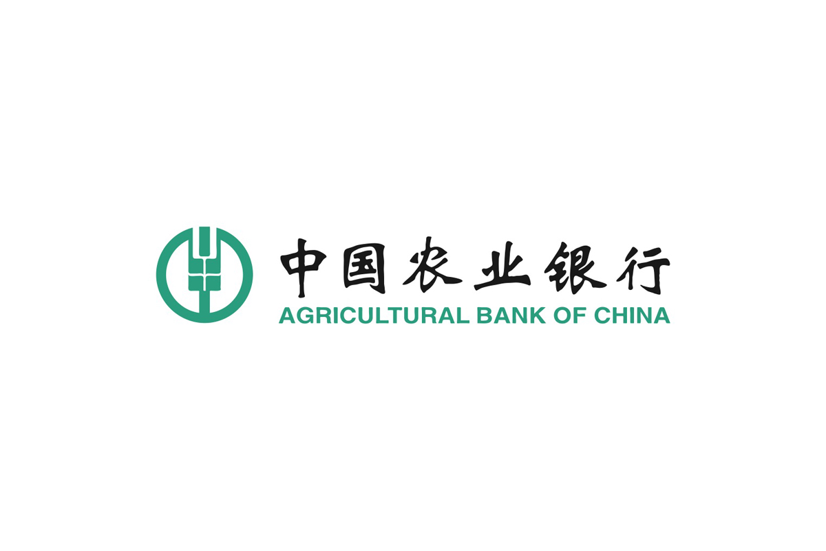
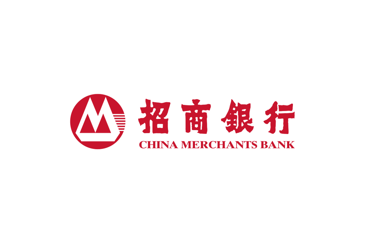
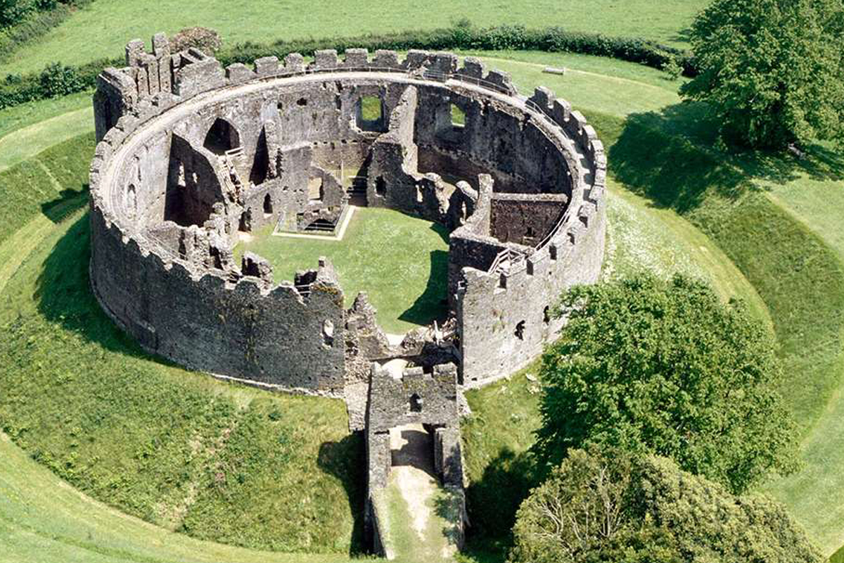
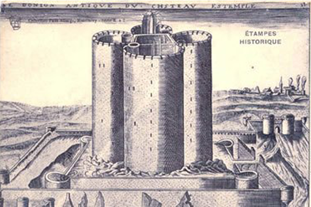
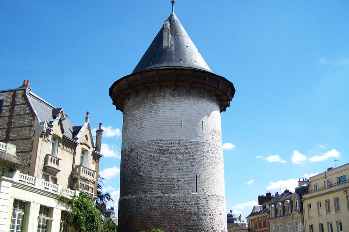
A castle's keep was used as a last resort should the rest of the castle fall to an adversary. The keep is a tower built to protect the occupants in case the castle itself was broken into during an attack.
The concept of the castle's keep, with its impenetrably thick walls, it’s balanced symmetry, it’s square or circular shape. The birds-eye view of the castle illustrates clearly how protected the interior is, just how hard it would have been to attack, with its vastly thick boundary walls, and often with only narrow paths to enter the space.
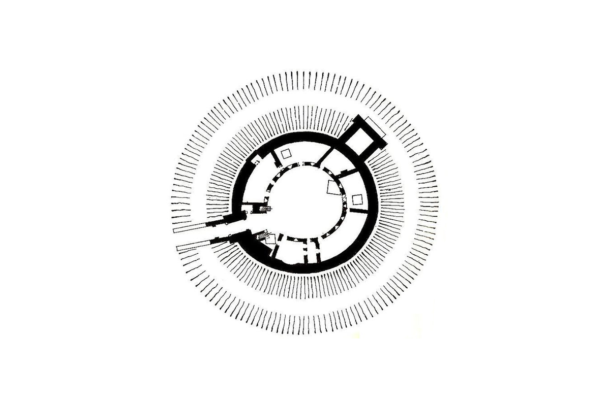
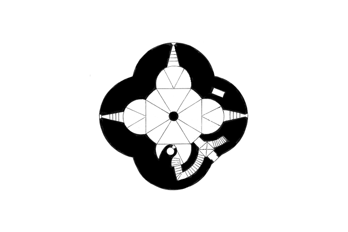
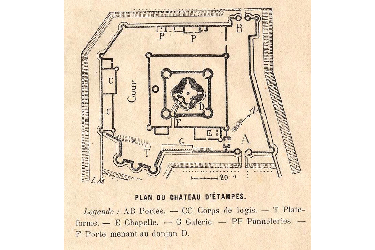
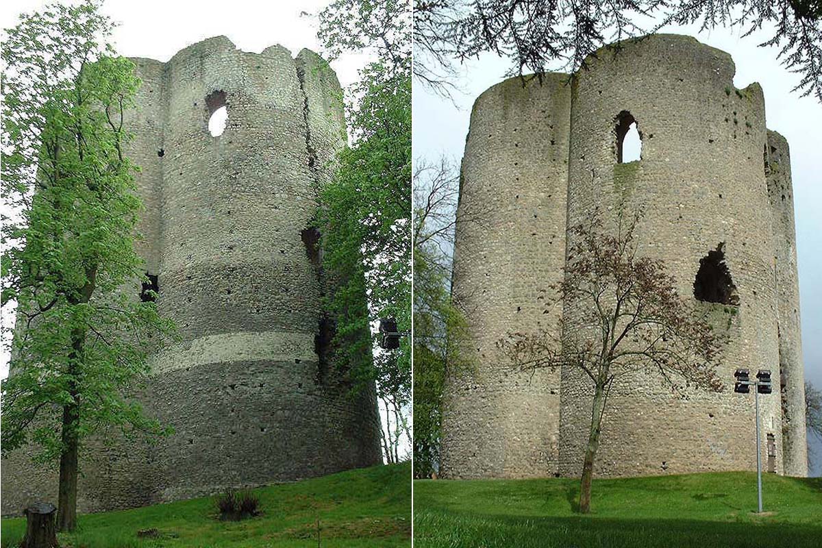


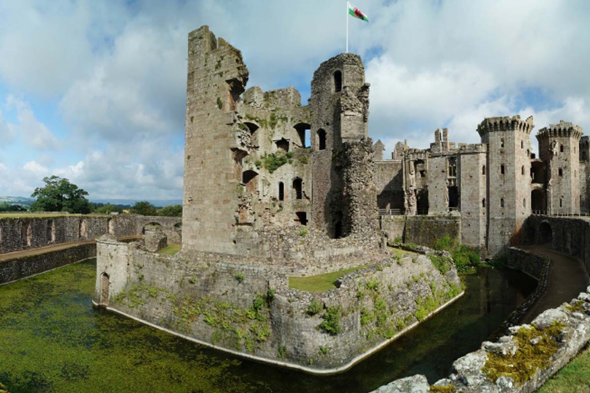
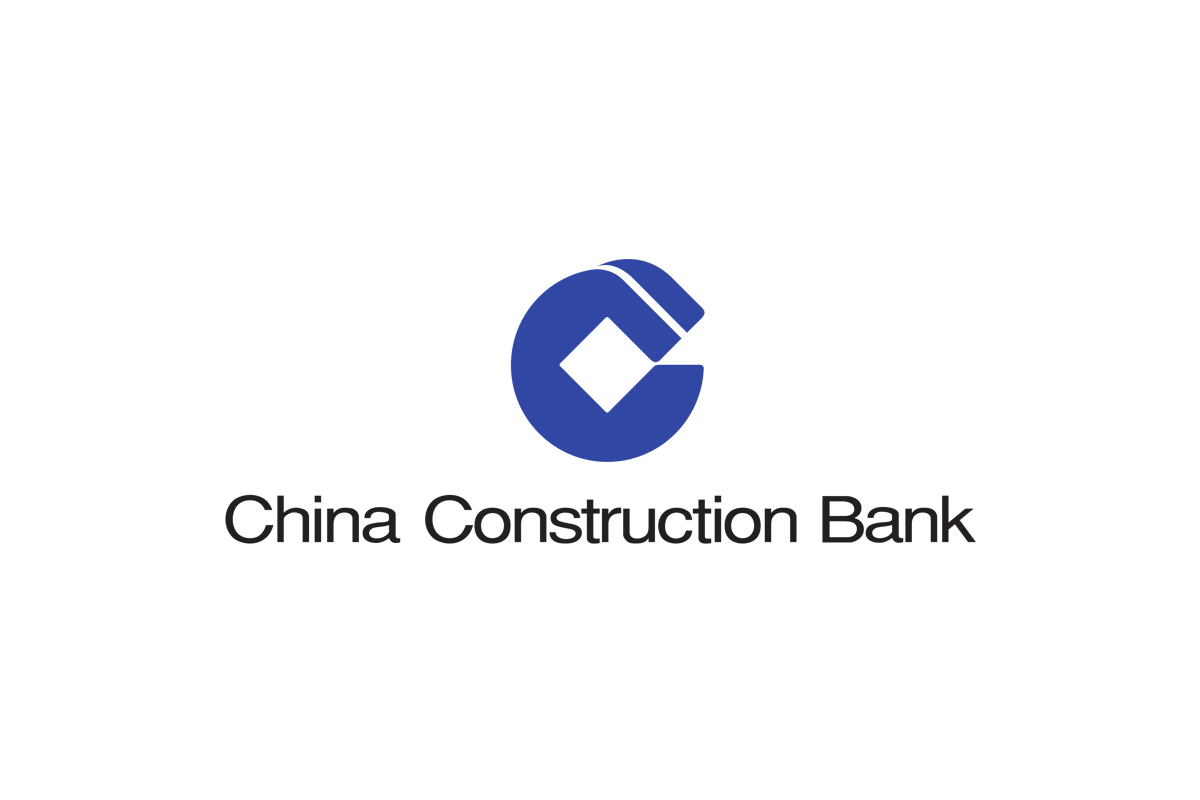
Many bank's logos are designed around the top-view of a castle's keep. The top plan of the keep shows the power, and strength of the castle, the thick walls, with often one path in and out of the through it’s main gate, illustrated in the white space within the logo. The keep might also have hidden rooms found through maze style corridors.


Shared visual attributes include; symmetrical and balanced basic shapes, commonly round, square and hexagonal; proportionally thick outer walls in comparison to the inner white space; one or a few narrow paths to the centre from the outside.
Ultimately it is the visual metaphors of the castle’s strength, safety and dominance mirrored into the logo design is what helps inspire trust in it's audience.
—
About the author, Adam
Adam is the design director of BrandCraft. BrandCraft is a branding and design consultancy based in Hong Kong. We specialise in branding, visual identity, corporate identity and rebranding.
Adam is a branding consultant and has worked with clients in the UK, USA, Hong Kong, Tokyo, South Korea and China. He has had self-initiated art and design projects exhibited at various galleries and museums including the Victoria & Albert Museum of Art and Design and regularly writes about branding and design theory.
Read more about BrandCraft