
What makes a good logo?
09.03.18
How can you class a logo, as good or bad? What are the principles that can we apply to logo design? We cannot consider ‘good design’ without first quoting from Dieter Rams' Ten Principles of Good Design:
Good design:
is innovative – The possibilities for progression are not, by any means, exhausted. Technological development is always offering new opportunities for original designs. But imaginative design always develops in tandem with improving technology, and can never be an end in itself.
makes a product useful – A product is bought to be used. It has to satisfy not only functional, but also psychological and aesthetic criteria. Good design emphasizes the usefulness of a product whilst disregarding anything that could detract from it.
is aesthetic – The aesthetic quality of a product is integral to its usefulness because products are used every day and have an effect on people and their well-being. Only well-executed objects can be beautiful.
makes a product understandable – It clarifies the product’s structure. Better still, it can make the product clearly express its function by making use of the user's intuition. At best, it is self-explanatory.
is unobtrusive – Products fulfilling a purpose are like tools. They are neither decorative objects nor works of art. Their design should therefore be both neutral and restrained, to leave room for the user's self-expression.
is honest – It does not make a product appear more innovative, powerful or valuable than it really is. It does not attempt to manipulate the consumer with promises that cannot be kept.
is long-lasting – It avoids being fashionable and therefore never appears antiquated. Unlike fashionable design, it lasts many years – even in today's throwaway society.
is thorough down to the last detail – Nothing must be arbitrary or left to chance. Care and accuracy in the design process show respect towards the consumer.
is environmentally friendly – Design makes an important contribution to the preservation of the environment. It conserves resources and minimizes physical and visual pollution throughout the lifecycle of the product.
is as little design as possible – Less, but better – because it concentrates on the essential aspects, and the products are not burdened with non-essentials. Back to purity, back to simplicity.
Dieter Rams' ten principles of Good Design - wikipedia
Dieter Rams, is a godfather of industrial design. His work for Braun has influenced most levels of the product and interface design of Apple. From the iPhone calculator interface to the iPod scrolling wheel and even the chamfered edges of the iMac, Apple products were created in Braun's image.
Principles of good logo design:
Good logo design is innovative - The logo must be designed to differentiate the company within its industry.
Good logo design is aesthetic - The logo should be aesthetically balanced. It should not be pretty for the sake of pretty, but it should not be ugly.
Good logo design makes a product understandable - A good logo must be contextual and relevant to the product of service that it is designed to represent.
Good logo design is honest - A great logo truthfully represents it's brand.
Good logo design is long-lasting - Great logo design does not follow trends whether they are fashion, graphic or cultural trends. The highest valued brands have huge emotional buy-in from its customers, followers and tribes. As a great logo is one that withstands time it must not follow any aesthetic trends.
Good logo design is thorough down to the last detail - The strongest identities are crafted within critical processes. The most valued companies in the world have the simplest logos. Simple logos have clear meanings.
Good logo design involves as little design as possible - The logo should be simple enough to be drawn from memory and flexible enough to be used across multiple touch-points.
Three examples of good logo design in Hong Kong
1. The Hong Kong Polytechnic
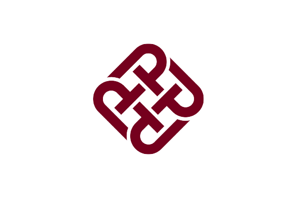

PolyU started it's life in 1937 as the 'Government Trade School' and was originally situated in Wan Chai. After the Second World War the school became the 'Hong Kong Technical College', and in 1957 opened it's current premises in Hung Hom. In 1994, it assumed full university status and was rebranded 'The Hong Kong Polytechnic University'.
The university has broad faculties of business, construction, engineering, humanities, design and tourism management.
The PolyU logo uses repeating, overlapping 'P's, which translates ideas of community, kinship and togetherness. With traditional interlocking design, the logo clearly shows ideas of collaboration.
2. M+ Muesum

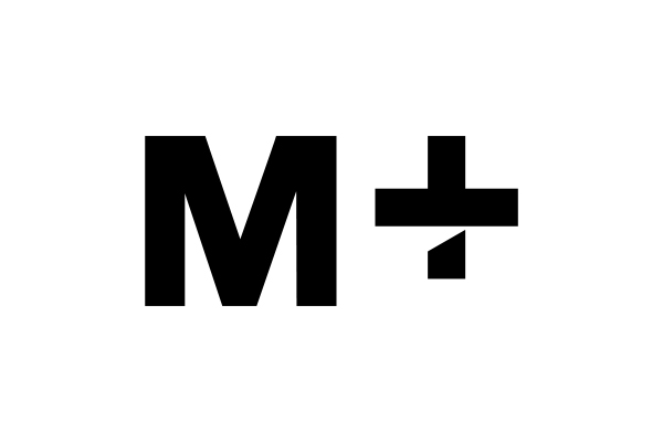

Part of West Kowloon Cultural District development, M+ is the new museum for visual culture in Hong Kong. The museum forms the centre for documenting and exhibiting work across 20th and 21st century visual arts and architecture.
The logo is refined, critical, contemporary. The mark aims to translate the impression of three-dimensional space with the cut lower part of the '+'. This cut, also hints at the traditional brush-ink scriptures.
As museum logos will be used on almost an almost never-ending amount of touch-points across digital, print, way-finding, sponsored events, catalogues etc, it is more important than ever that the logo is part of a flexible system that forms the visual identity. This mark fulfils this requirement as the logo looks as good in negative, within a square or circle for social media, in the corner of a letterhead or as a flag in front of the museum. A mark such as this, aesthetically simple and clear, is designed to last.
3. Hong Kong Electric
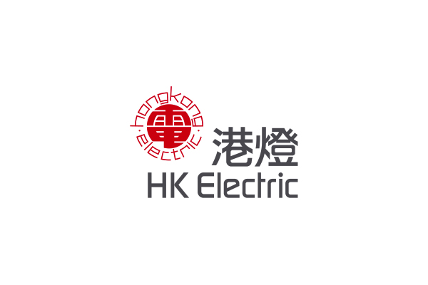

Based on a traditional Chinese chop, the logo remains contemporary with the use of thick, bold Chinese characters, surrounded by 'Hong Kong Electric' set in an almost futuristic, typeface.
These features ensure the utilities company stays contextual and relevant.
Relevant blog posts
How to Design a Logo
Brand Authenticity is Hard to Fake
The Value of a Logo
About the author, Adam
Adam is the design director of BrandCraft. BrandCraft is a branding and design consultancy based in Hong Kong. We specialise in branding, visual identity, corporate identity and rebranding.
Adam is a branding consultant and has worked with clients in the UK, USA, Hong Kong, Tokyo, South Korea and China. He has had self-initiated art and design projects exhibited at various galleries and museums including the Victoria & Albert Museum of Art and Design and regularly writes about branding and design theory.
Read more about BrandCraft