
How to Design an Iconic Logo?
Waxing lyrical about all things logo, a study of some of the most iconic logos in the world.
As a branding agency, our process involves asking questions, listening and observing. Logos are vessels of an organisation's core values and communicators of brand equity. Logos are the preliminary device of recognition for any company.
— What makes something iconic?
— What makes a logo last a hundred years?
— What makes a logo ‘iconic’?
— What ‘kind’ of logo is right for my business?
Logos are vessels of core values and communicators of brand equity. Logos are the preliminary device of recognition. However they’re named, logos/ logotypes/ logomarks/ icons, there are 4 key types.
1. Abstract logomarks
2. Pictorial logomarks
3. Logotypes
4. Monograms
1. Abstract logomarks
These are the hardest logos to make reach public consciousness. But when they do, they’re immensely powerful and remain there forever. The simpler the mark is, the more powerful and iconic it can become when compounded by time. The simpler the logomark, the easier and more consistent it will remain when applied.
In their simplicity, abstract logomarks have the powerful ability to imply so much meaning by saying so little.


Woolmark by Franco Grignani, 1963
The Woolmark logomark is a beautifully balanced icon. The icon expresses the weaving of wool and the craft and attention to detail of the company. The Woolmark logomark is often referred to as one of the best logos ever created.
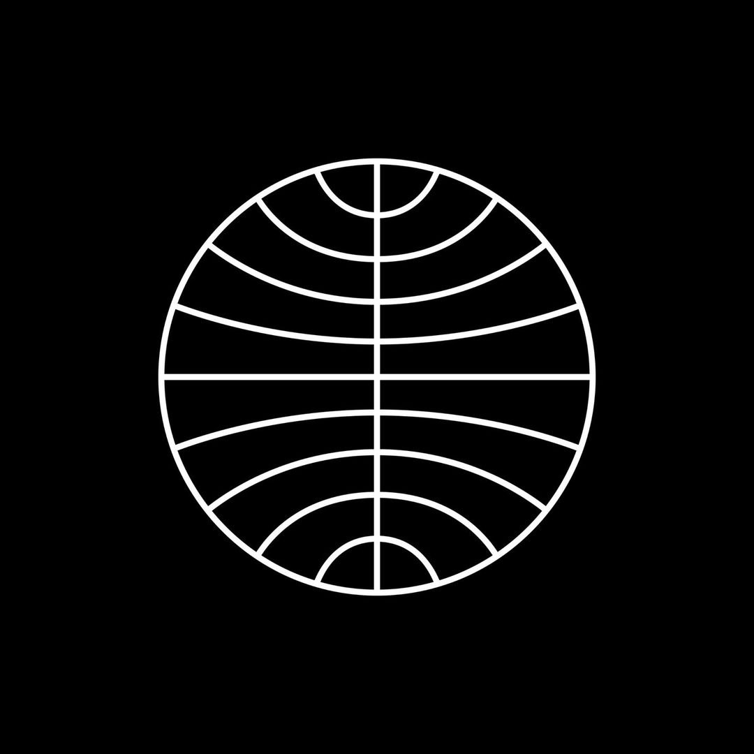
Pan Am by Edward Barnes & Charles Forberg, 1955
The Pam Am logomark represents the world.
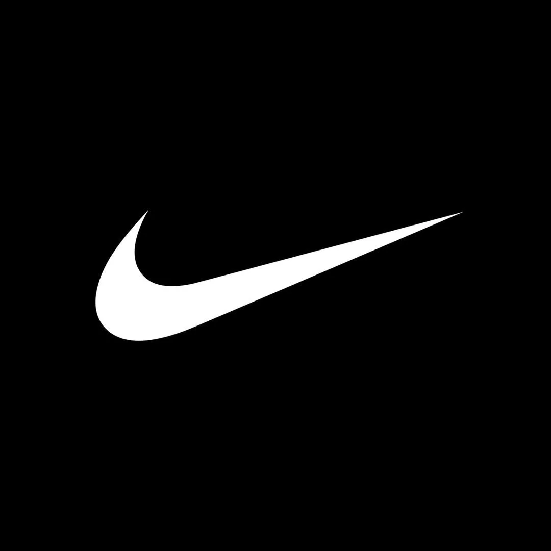
Nike by Carolyn Davidson, 1971
The Nike Swoosh metaphor of speed is created by the shape itself and how it carries the eye across the mark, up and right towards the ‘future’.
Hong Kong & Shanghai Banking Corporation by Henry Steiner, 1983
The HSBC abstract mark, uses simple triangles to create a play between white space, and the relationship between ‘the protector’ and ‘the protectee’ metaphor. The abstract mark also implies the shape of a square, being opened from either side.
Without direct meaning themselves, visual metaphors can only imply meaning, which allows the marks to build meaning to the audience naturally over time.
2. Pictorial logomarks
Pictorial logomarks are far more literal than abstract marks.
Easier to reach public consciousness, due to the pictorial relevance to the business, these beautiful and iconic marks can express more personality and humanity than abstract, metaphorical forms of the marks above.
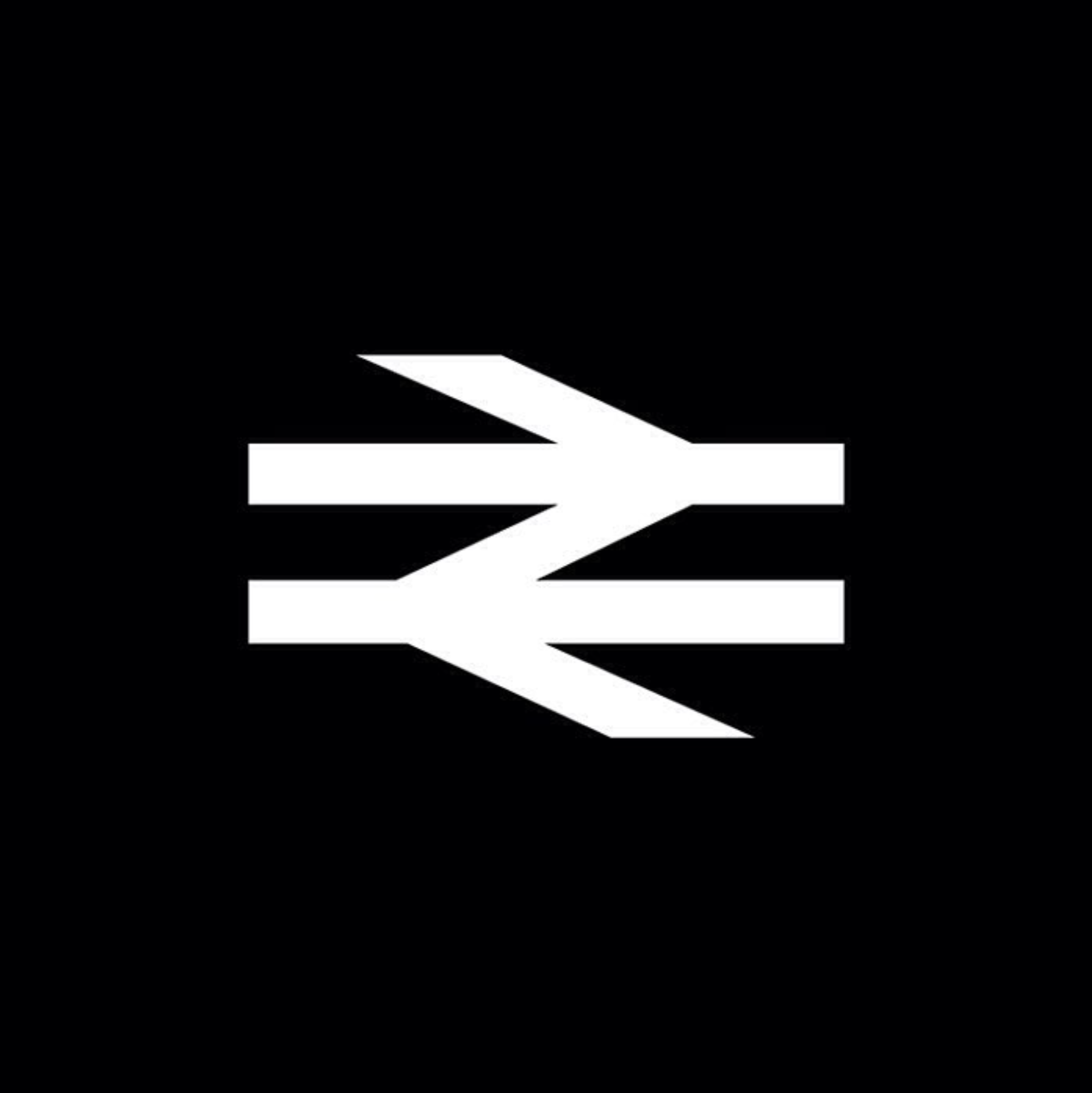


British Rail by Design Research Unit, 1965
The British Rail mark directly illustrates the railway tracks, and the movement of trains left and right horizontally.
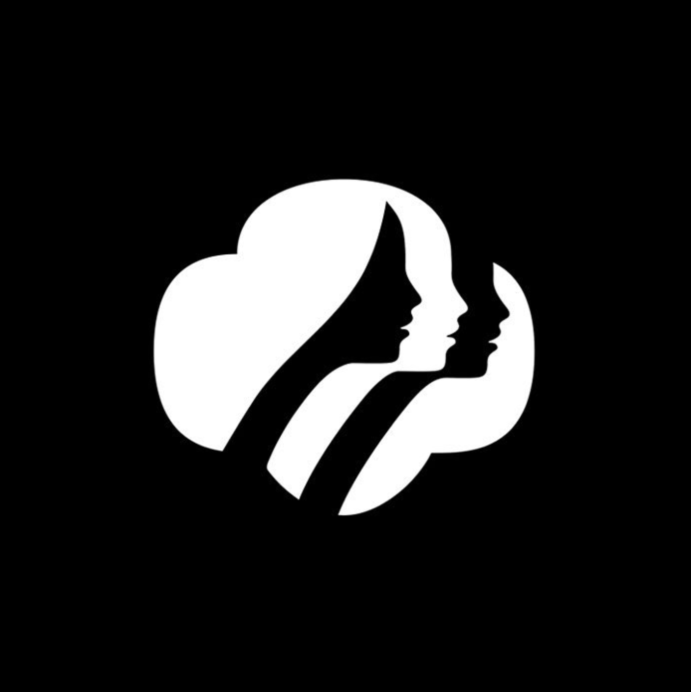
Girl Scouts of America by Saul Bass, 1978
The Girl Scouts of America logo illustrates the camaraderie, friendship and growth that the association inspires.
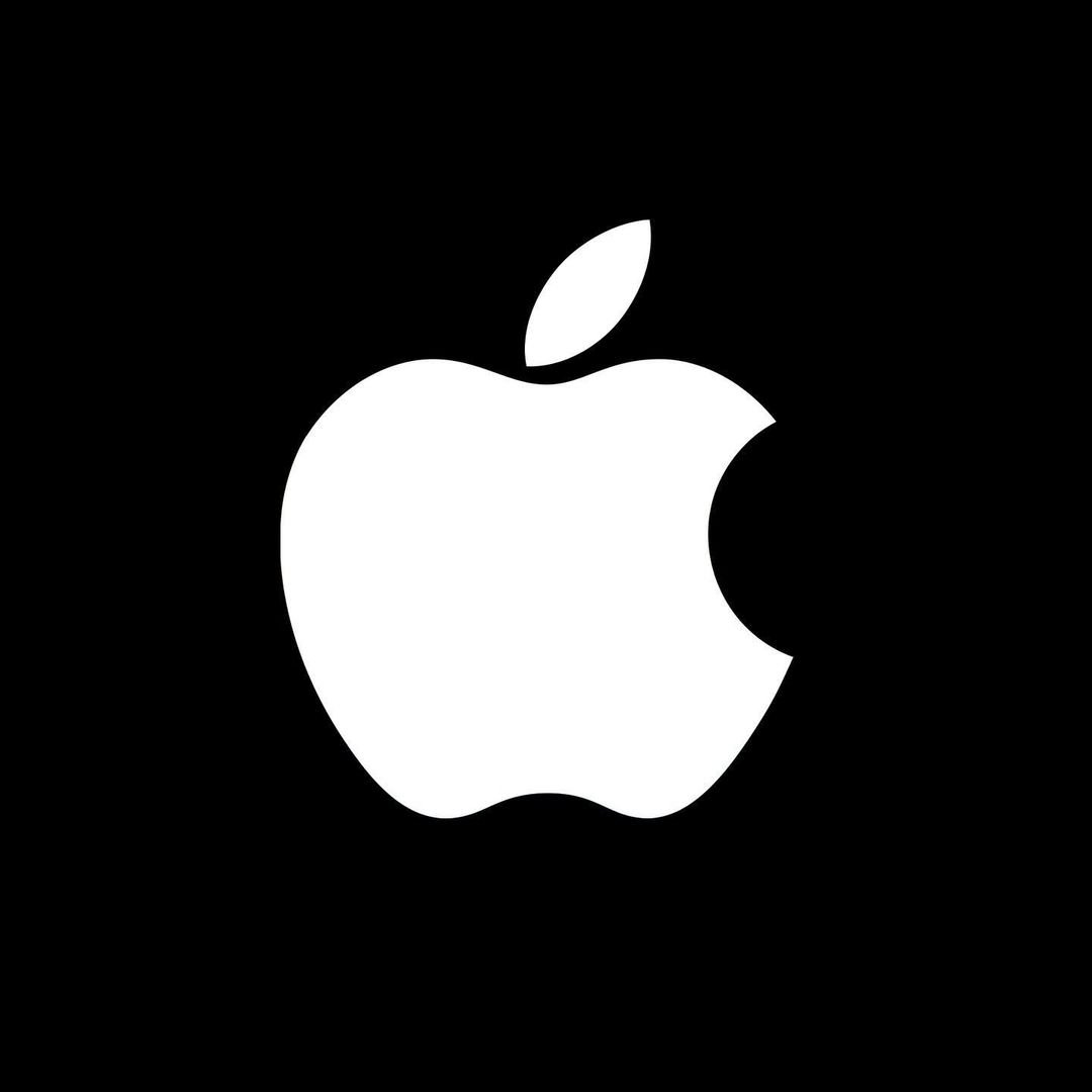
Apple by Rob Janoff, 1977
However literal, pictorial logomarks do not always have a clear meaning. For example, the Apple logomark does not in itself, relate to their values of ‘innovation’ and ‘technology’, but is an evolution of their original logo, which it still speaks to today — Isaac Newton, sitting under an apple tree, when he was hit in the head by a falling apple, the fabled ‘aha moment’ when he discovered his law of gravity.
Lufthansa by Otl Aicher, 1963
The Lufthansa logomark beautifully illustrates the crane, a bird common to Germany. The simplified icon expresses hope, elegance and detail.
Martin Newcombe Property Maintenance by Buddy, 2009
This beautifully simple logo combines the idea of property and maintenance.
3. Logotypes
Logotypes are far easier to work themselves into the general consciousness and recognisable brand landscape than logomarks.

Amazon by Turner Duckworth, 2012
The Amazon logotype uses a rounded sans-serif typeface in lowercase to emphasise ‘approachability’, and, perhaps ironically their ‘locality’!
CNN by Anthony Guy Bost, ~1980
With ideas of technical prowess, journey and collectiveness, the CNN logotype compresses the letters into a single form. Almost the form of a neon sign, the logotype has a start, and an end, as if it's a singular cable, connecting the characters.
FedEx by Landor Associates, 1994
FedEx’s strong logotype famously use the ‘Ex’ to reveal an arrow hidden in the mark.
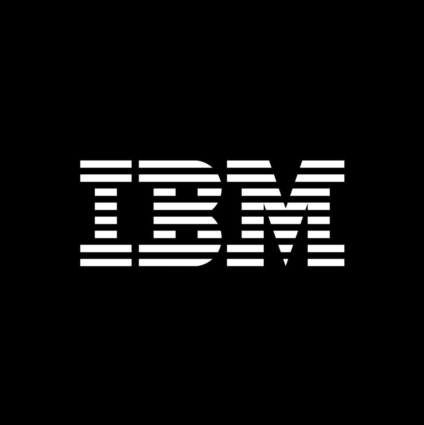
IBM by Paul Rand, 1972
The IBM logotype is designed to express strength in the thick slab-serif typeface. The horizontal lines that cut through the characters express their speed and mastery.
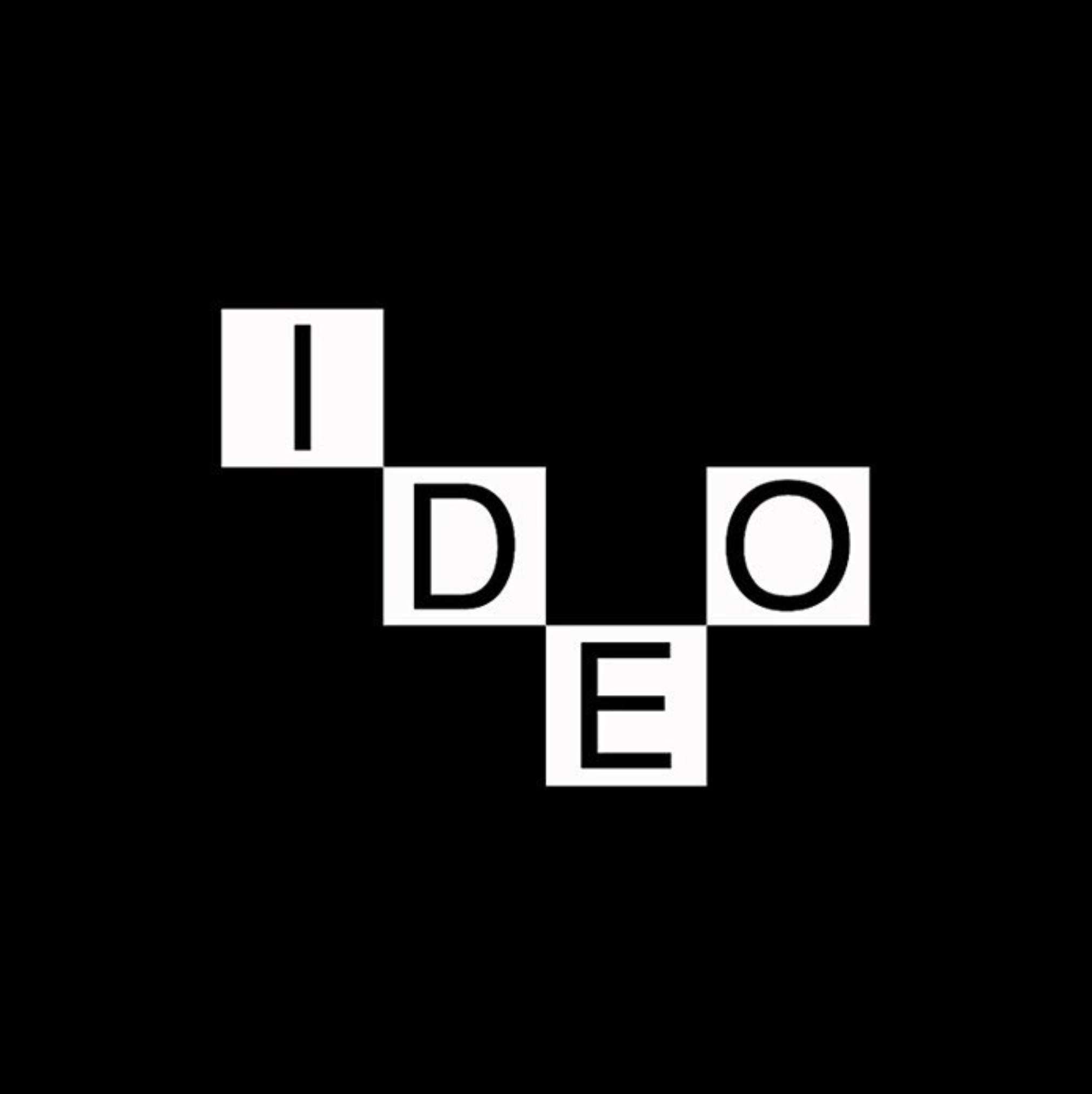
IDEO by Paul Rand, 1991
Building blocks express modularity, “thinking outside of the box”. The creative process is expressed through the relationship of flexibility and structure, function and form. A beautiful mark, impossible to imitate as any arrangement of such letters would immediately draw the mind to IDEO, the original owner.
4. Monograms
Monogram logos are based on lettermarks.
Randstad by Ben Bos, Total Design, 1967
The symmetrical double ‘R’ of Randstad, conveys idea of fairness, and harmony. The abstract form of the double ‘R’ almost suggests the welcoming open arms of a human torso.
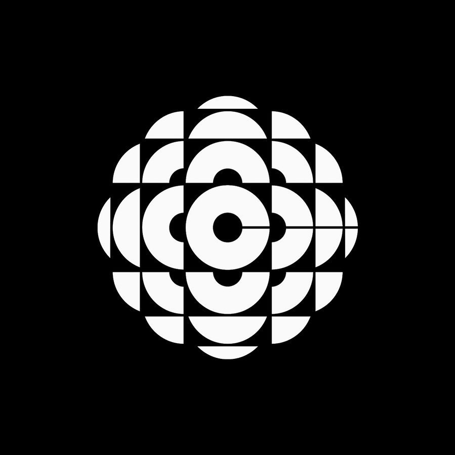
Canadian Broadcast Corporation by Burton Kramer, 1974
The geometric fragments beating out from the centre express a resonance, giving the mark a visual pulse.
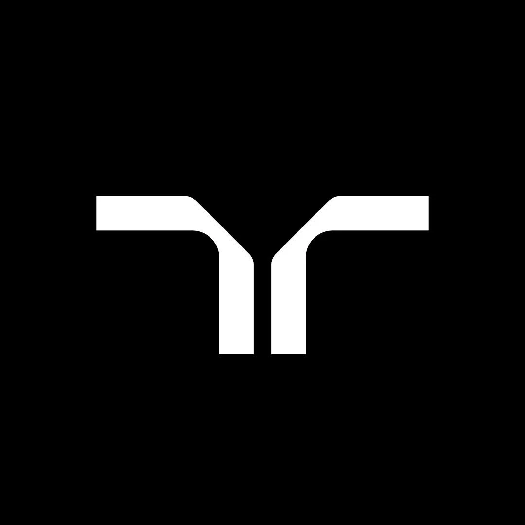
Japan National Railway by Kaji Yusuke, Yamamoto Yoji, Nagai Kazumasa & Kenmori Ikuo at DENTSU, 1987
The monogram conveys the connectedness of Japan's national railway. The sharp edges and confident form indicate its attention to detail. The sharp corner of the ‘R’ positioned at the centre of the mark gives it a visual balance.
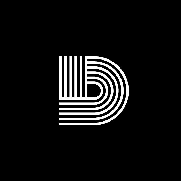
Dukane Corporation by William H. Goldsmith, 1975
The monogram illustrates technicality through its precise use of balanced black and white form. The logo cleverly and humbly expresses the way the capital ‘D’ is commonly written—first, the downward vertical. Second, the curving motion from the top across the right, then to the bottom. This humility expresses process, a critical approach. While we and another observer may not know the function of the company, the preciseness and criticality are clearly conveyed.
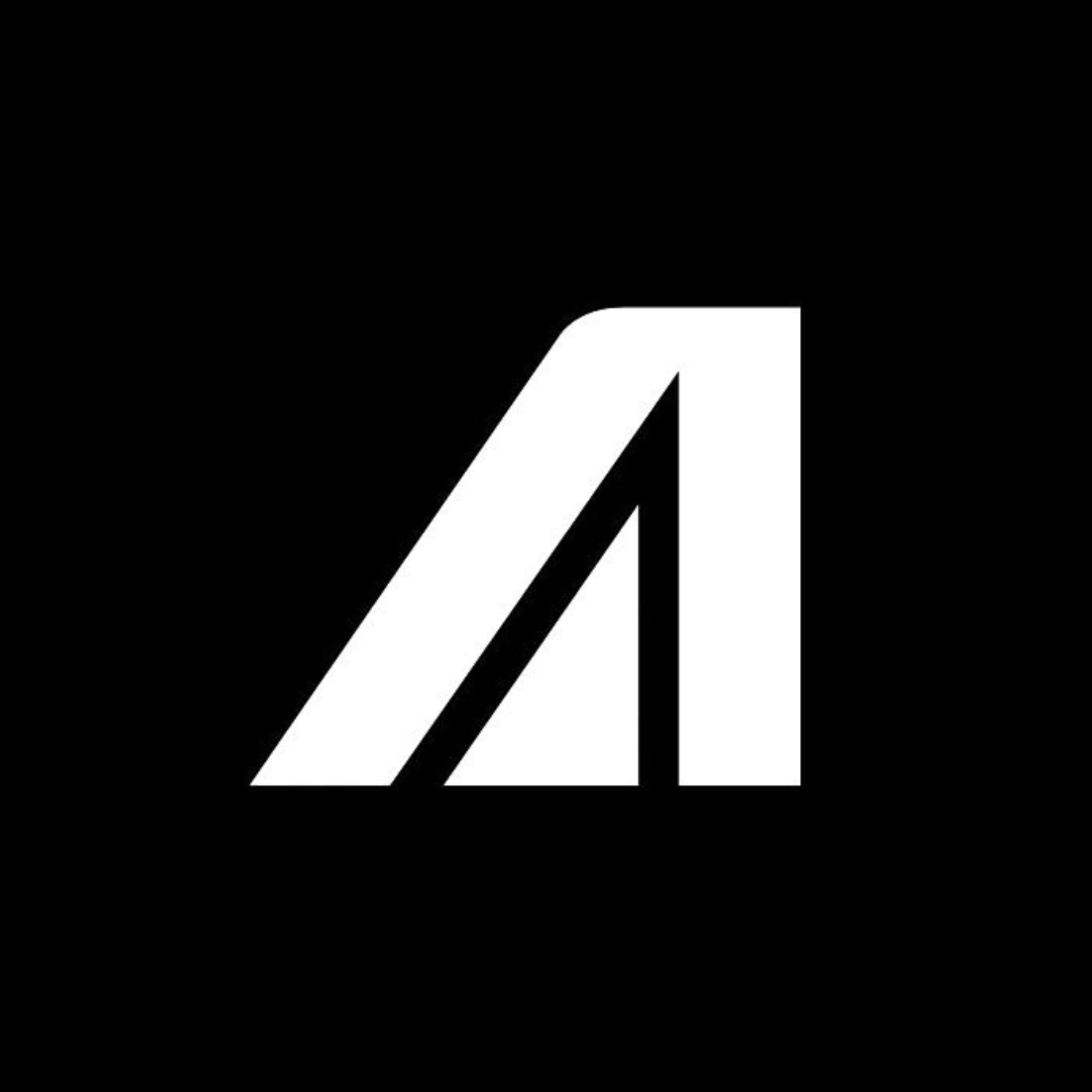
Alitalia Airlines by Walter Landor, 1967
The double-A, moving the eye diagonally up and right, from the ground into the air. Beautiful in its simplicity, future-proof and timeless. The curved top corner is reminiscent of the tail of an aeroplane.
Conclusion
We can plot types of logos against each other by considering the type of logo’s ability to be recognisable, and their ability to saturate the public consciousness. In abstract!
Logotypes make the easiest kind of logo to saturate public consciousness. The three other kinds all take much more time and marketing. Pictorial logomarks and abstract logomarks are almost equally recognisable, with abstract logos taking longer due to the difficulty in their personification.
Iconic logos:
— Are visually balanced
— Are simple
— Are contextual
— Communicate values