
Case Study — Rebranding RBJL
We recently completed a rebrand of renowned IP law firm, Robin Bridge & John Liu. 2023 marks the firm’s 40th anniversary. As with every project we undertake, it was a completely unique process.
Our case studies pages tend to be a critical overview of the project, so I wanted to use a longer form post to talk more about our approach and creative process.
Introduction
The project came about in an unusual way for us. Usually, we receive enquiries either from referrals, LinkedIn enquiries or directly through Google searches. RBJL was unique. At the end of 2022, we were about to onboard a new client and wanted to get a second opinion on one of our terms of engagement.
I reached out to three IP law firms in Hong Kong with a couple of questions. RBJL’s founding partner, Anthony, responded to me directly with very helpful pointers and also mentioned they would actually like to explore rebranding after CNY. A wonderfully fateful moment.
During CNY, Anthony emailed, and we penned in a meeting.
Rebranding is celebration of both the organisations past and future
Introduced in 1983, RBJL’s identity was also about to reach the grand age of 40 years old, and the partners, Anthea and Anthony felt it was the perfect time for a visual refresh.
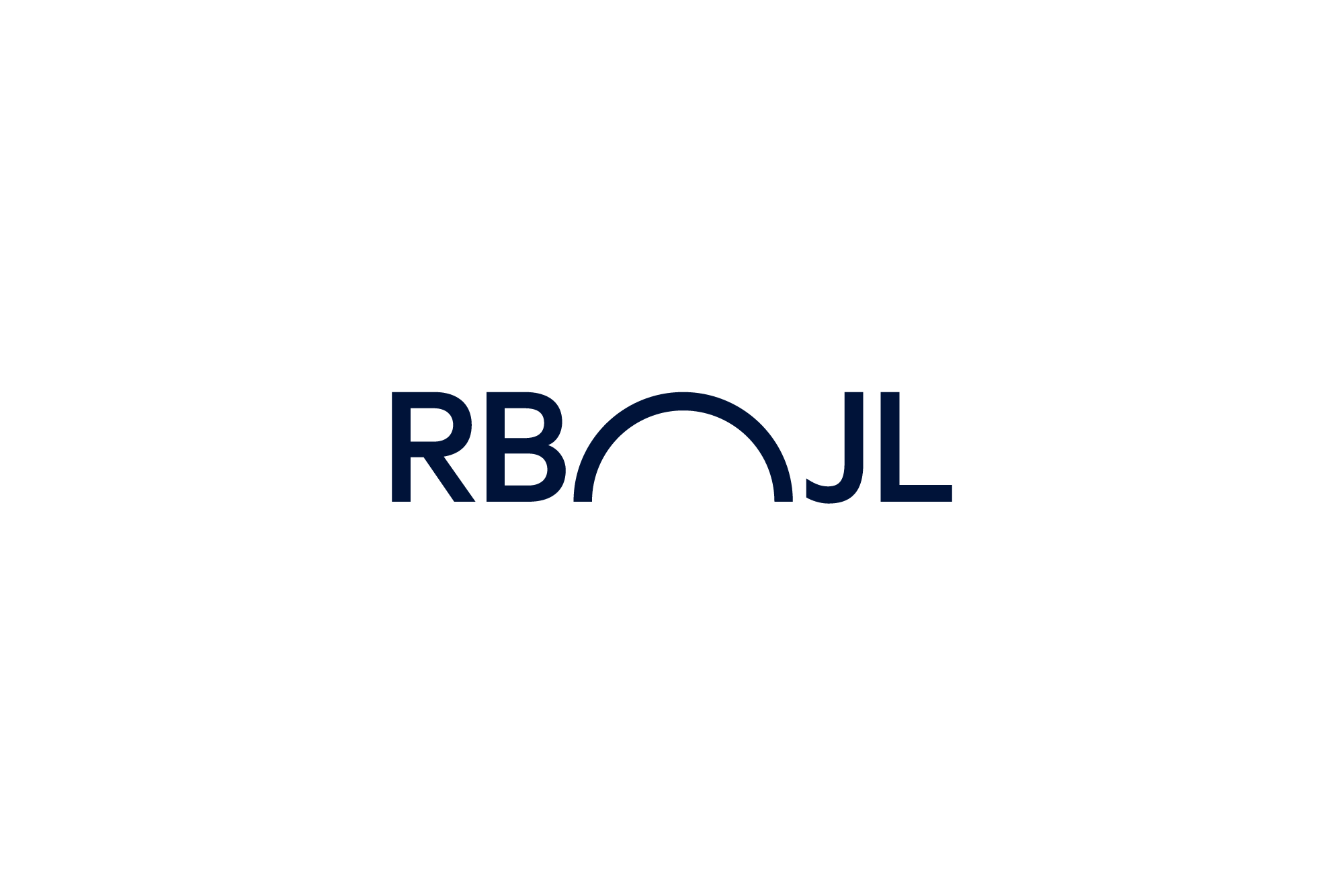
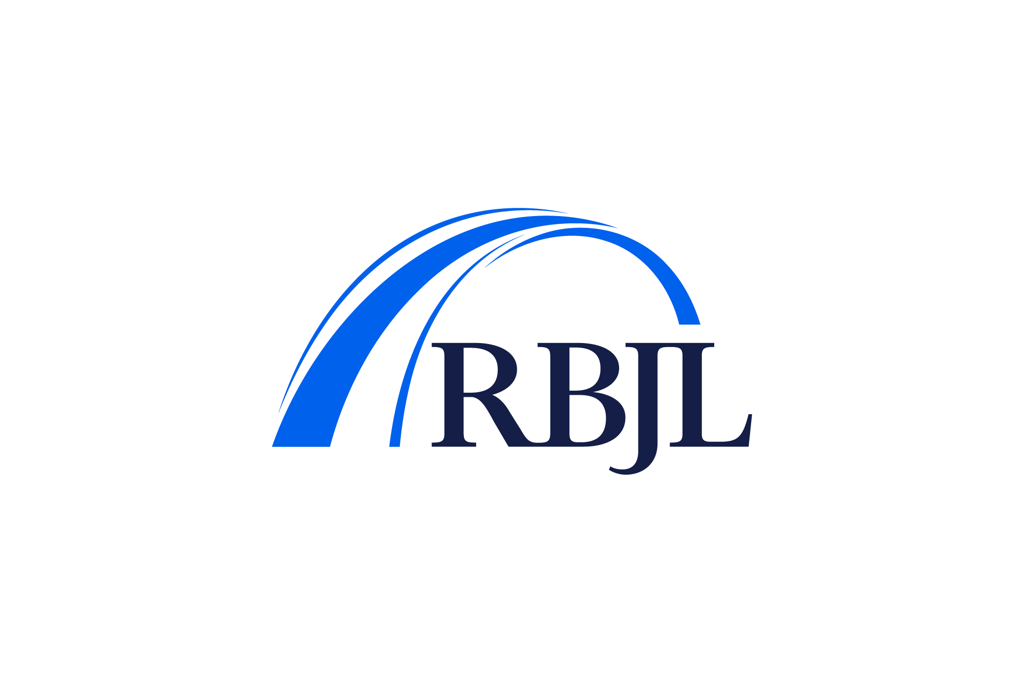
— Existing brand mark
The existing logo, website and brand touchpoints felt a little tired, of an era, and the partners wanted to use their anniversary as a kind of fresh start, with a future-focussed vision. There was also a functional issue, when the logo presented at small size
For new companies, the purpose of building a brand is to make the company memorable by communicating its personality, core values, and mission. For existing companies, rebranding is the process of making the organisation current and contextual to either a changed audience, culture, industry or product/ service.
Discovery
Brands must be distinctive, memorable, contextual and functional. Law firm brands in particular, must be trustworthy. We decided to put RBJL’s core values front and centre from the beginning. RBJL’s core values:
— Professionalism
— Proactiveness
— Pragmatism
Visual metaphors
We start every project’s visual phase by turning everything we’ve talked about the first phase of discovery and brand strategy strategy, into visuals. We like to call these visual metaphors. These references and moodboards are a fantastic way to begin conversations around something visual.
The idea/ metaphor of a bridge came around early in the discovery phase. Leveraging RBJL’s full name Robin Bridge & John Liu, this could be a great device for brand memorability and recall. Bridges are also fantastic metaphors for the concept of connection.
We collected visual references around bridge structures, particularly in Hong Kong.
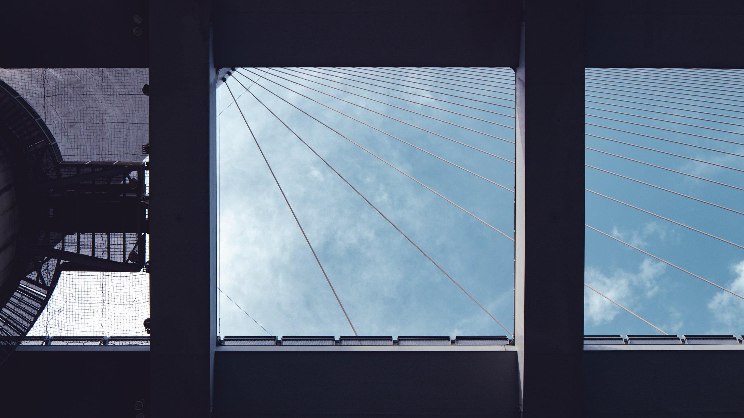
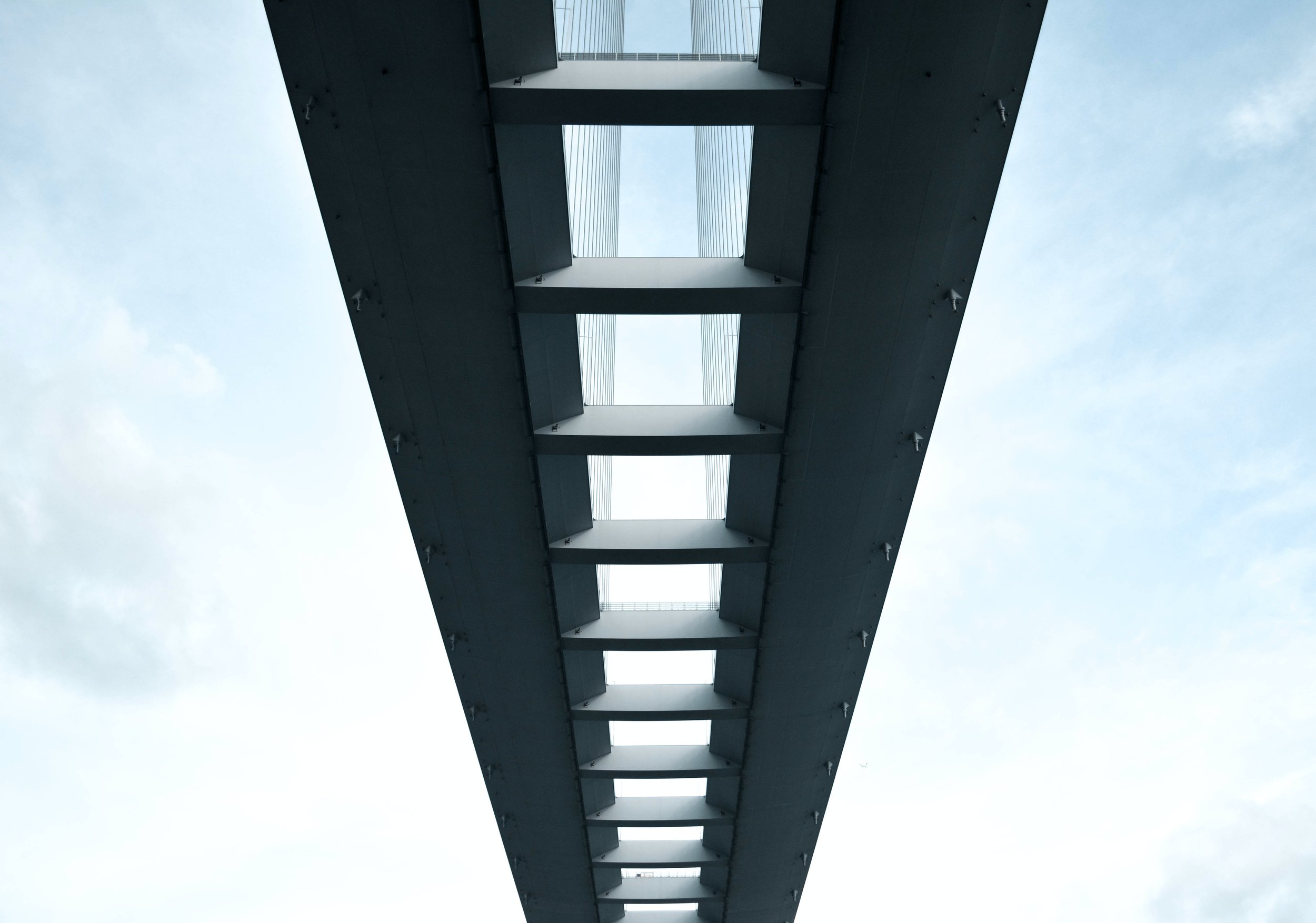
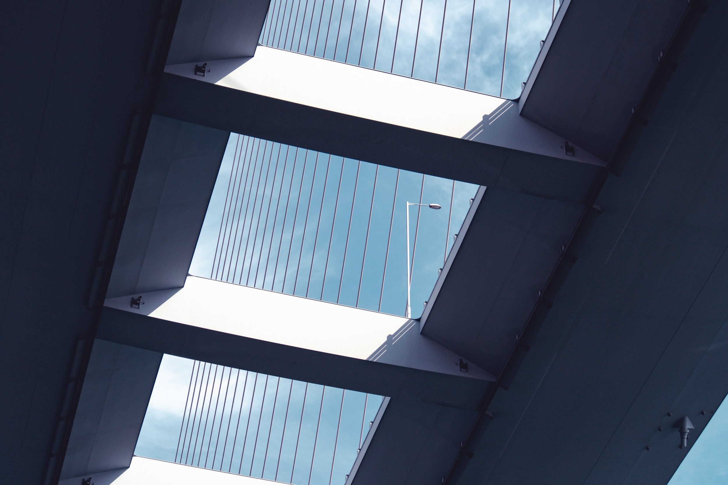

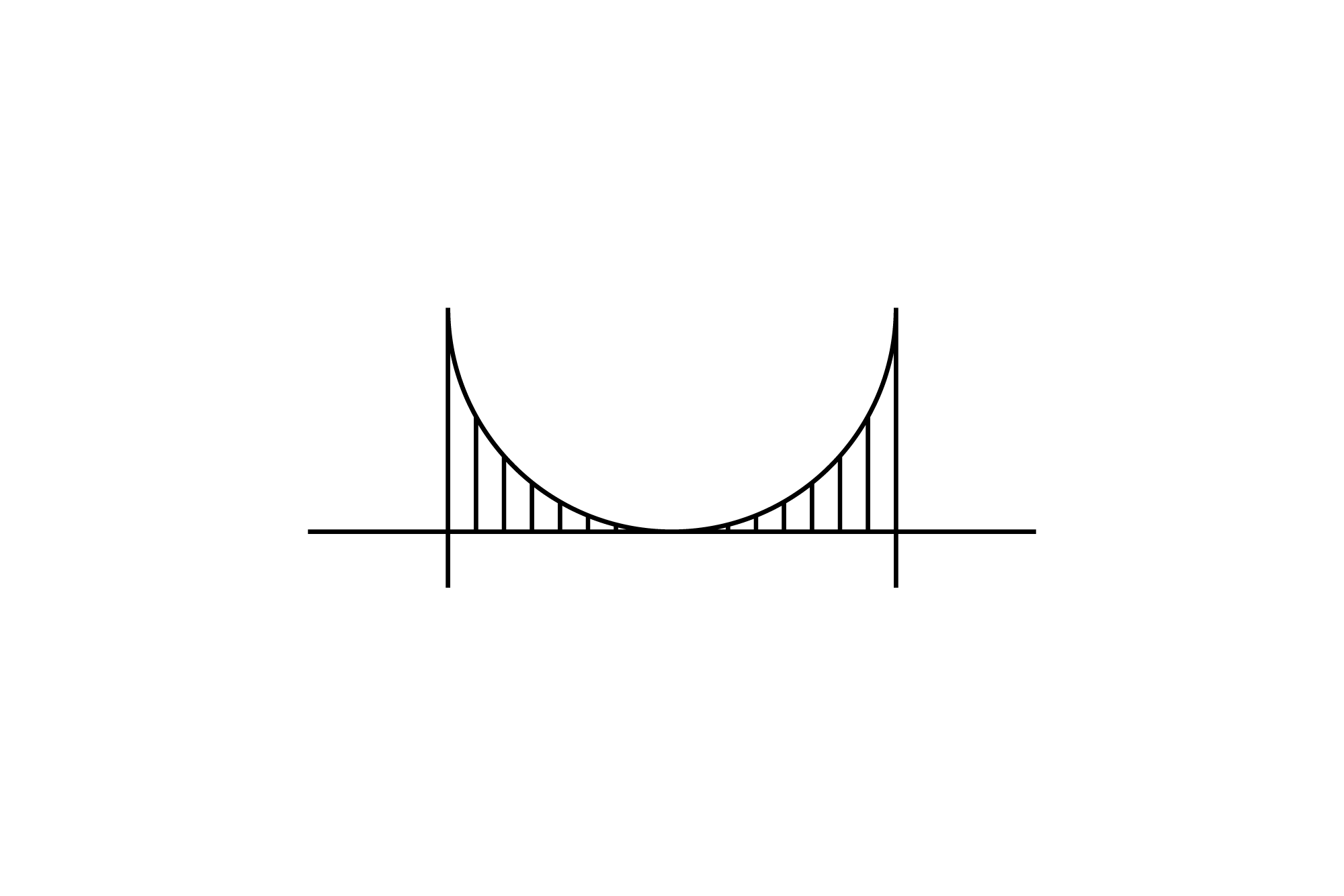
We were initially inspired by the shapes the architecture makes in the sky. The whitespace becomes beautiful frames of the sky, with the suspension bridge structures layering and cutting out sections.


Whilst we initially loved these images, we didn’t like the concept of the viewer looking up, from underneath the bridge. And, as a logo, it proved difficult to create a convincing enough visual representation.

— Ting Kau Bridge by Manson Yim, via Unsplash

— Ting Kau Bridge by Tim Cheung, via Unsplash

— Tsing Ma Bridge by Chi Hung Wong, via Unsplash

— Ting Kau Bridge by Manson Yim, via Unsplash
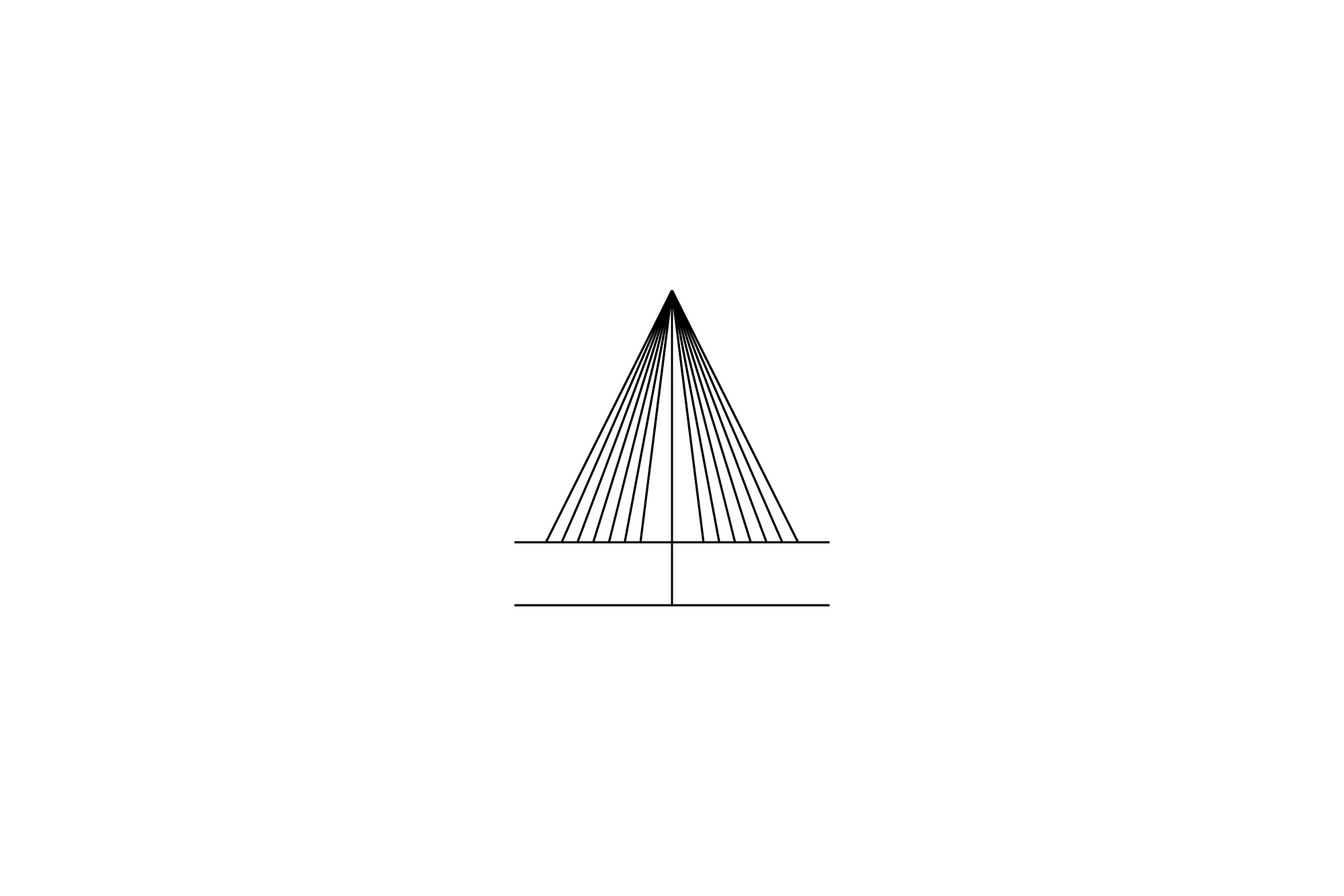
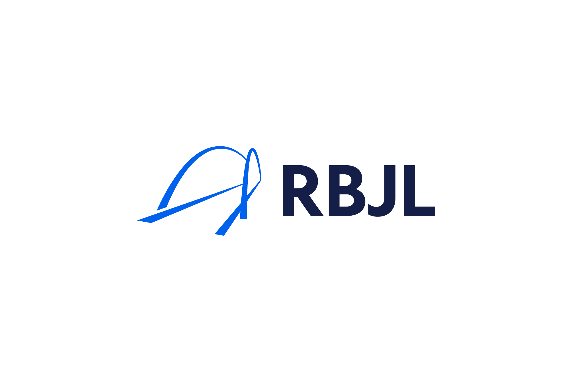
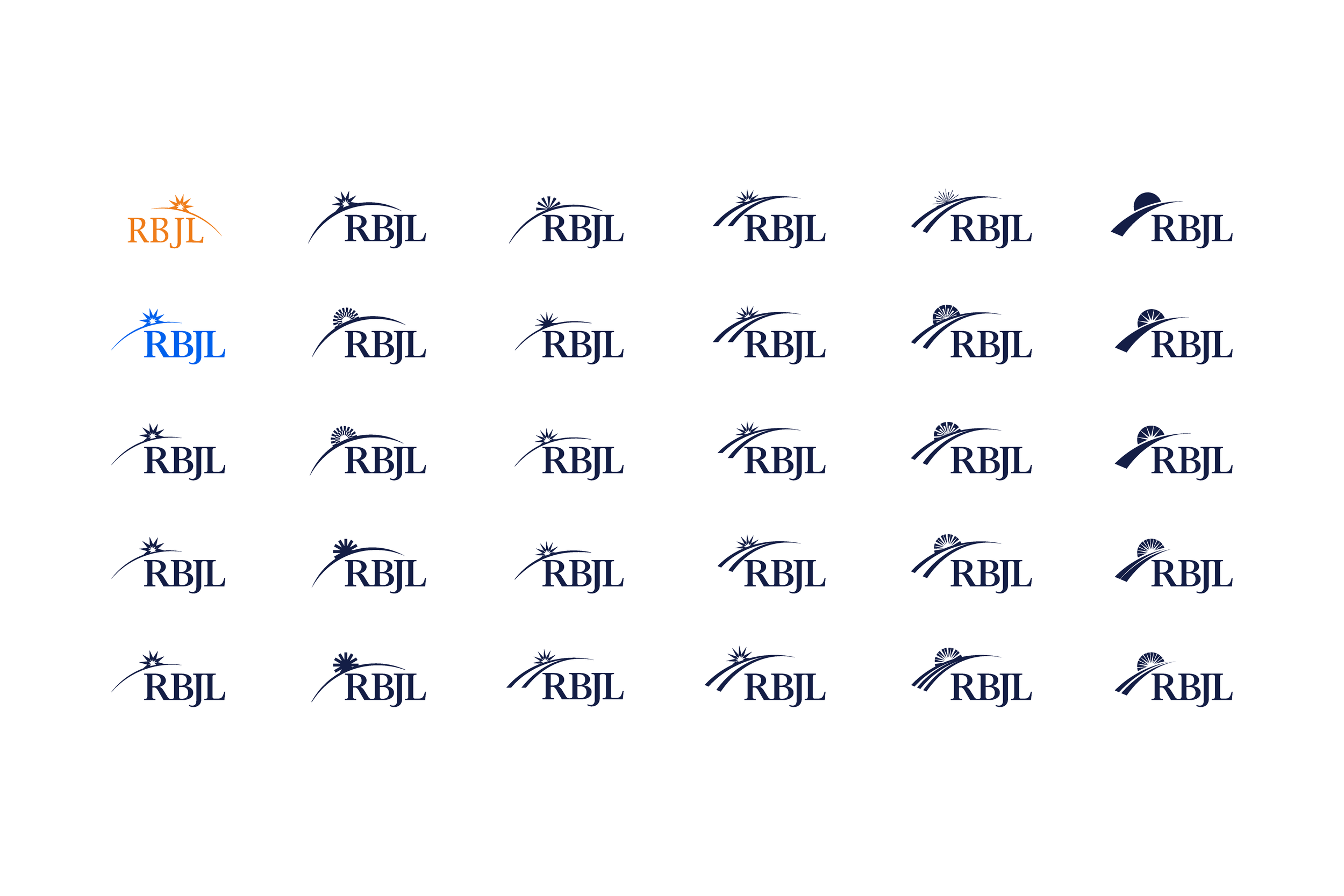
We came back to the full bridge silhouette, and explored various directions we could then create a logo from.
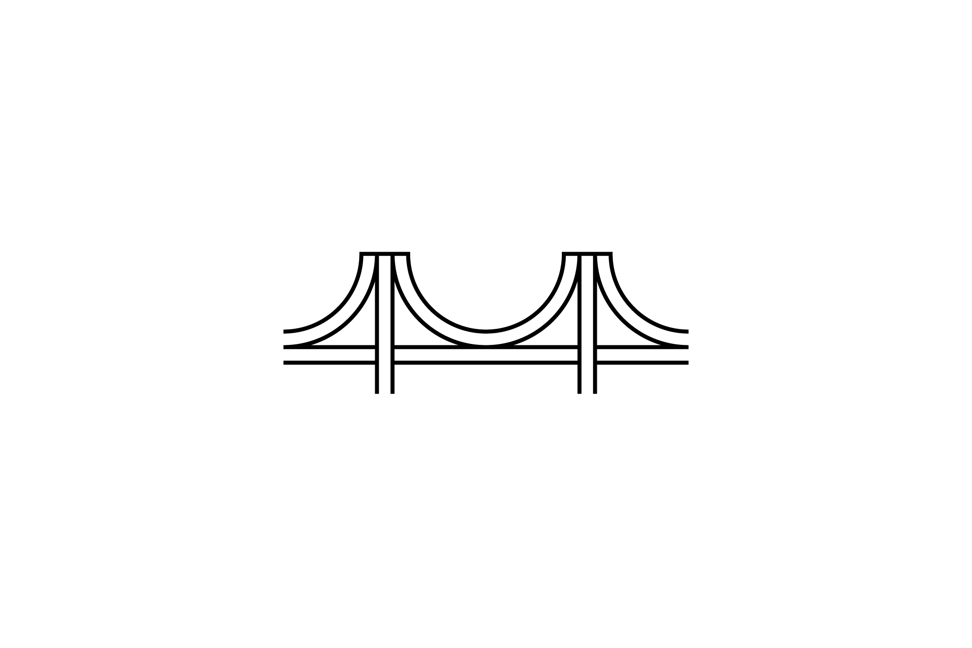
We explored a simple side view, to an isometric, 3-dimensional view. However, as a logo, when small, functionality would prove an issue, either too detailed to work at a small size, or too literal, simple and cartoon-like.
It was back to the drawing board!
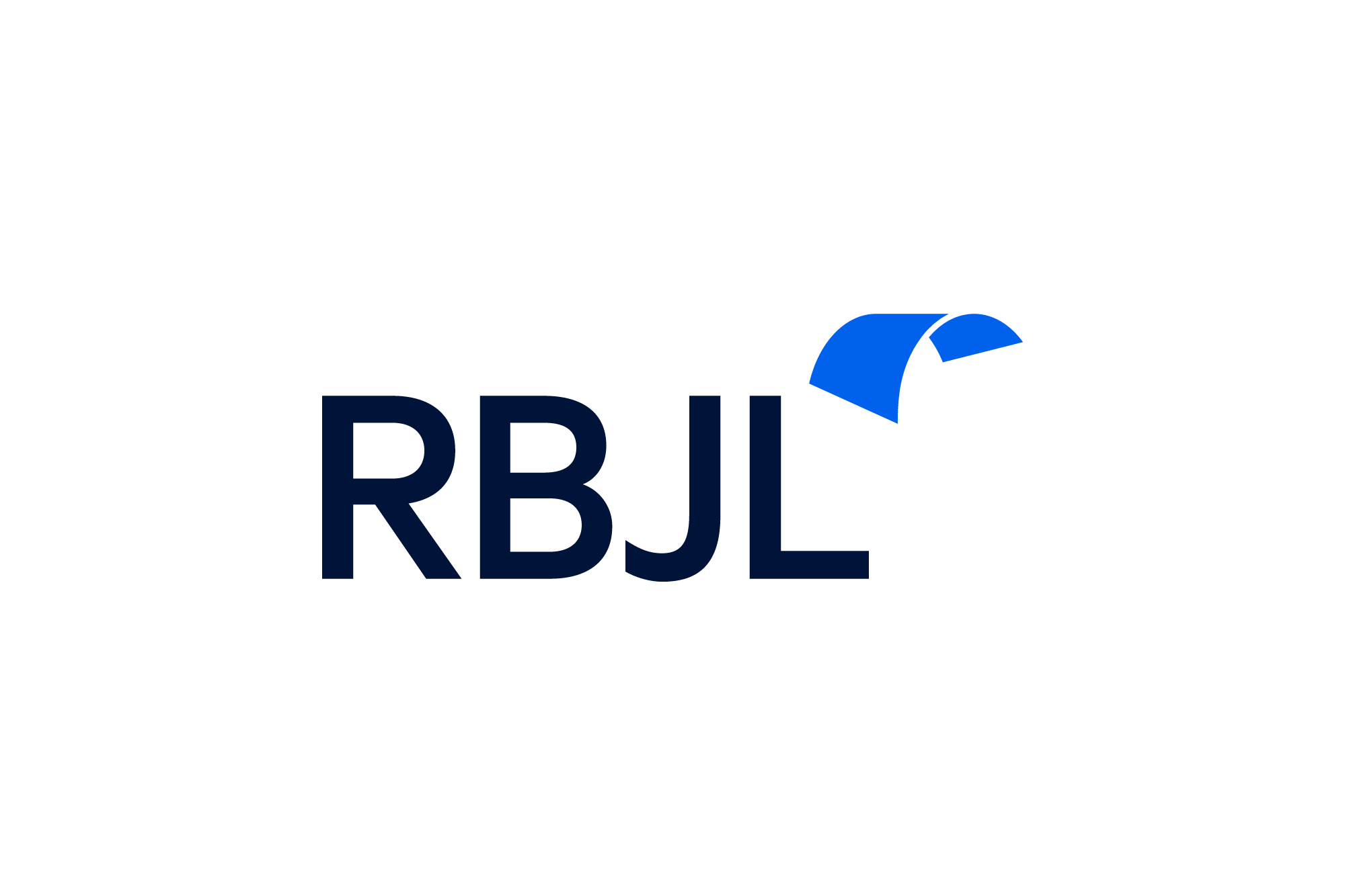
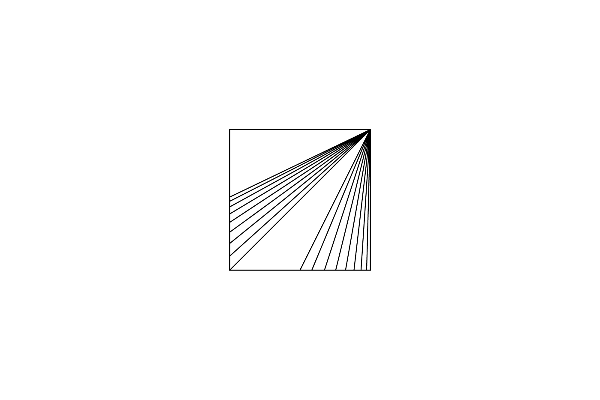
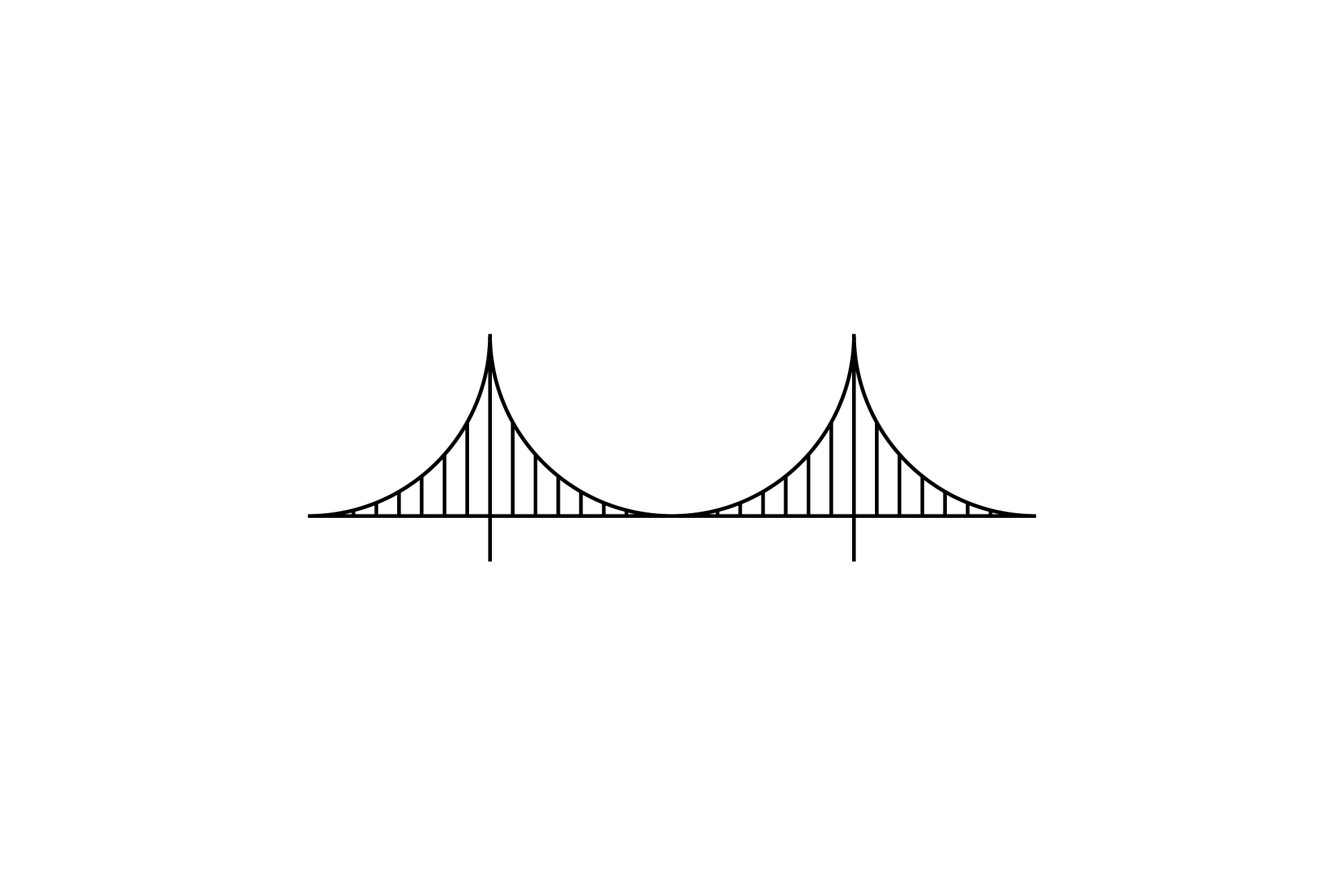
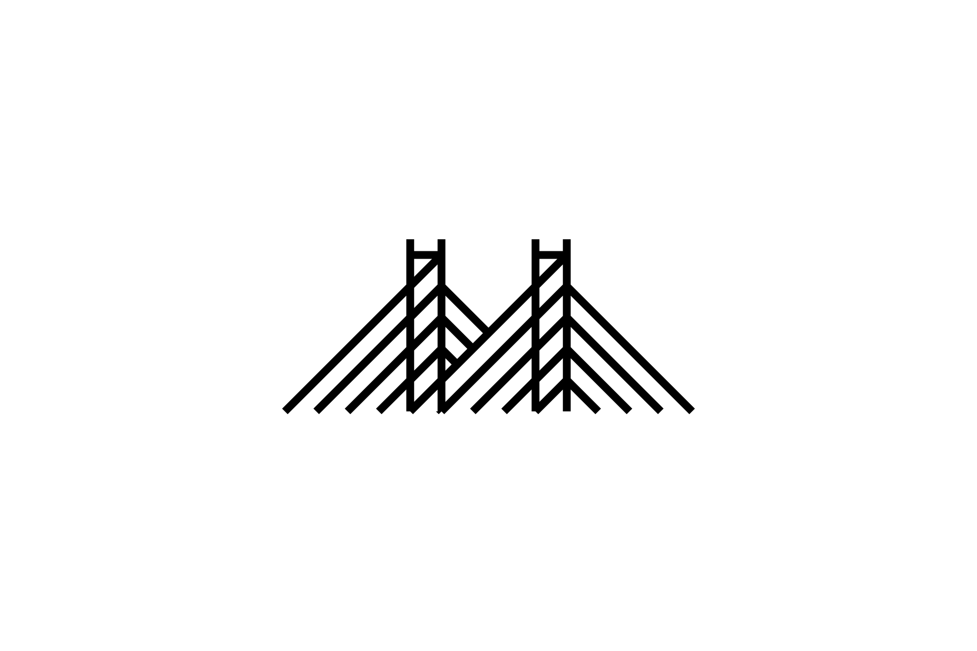
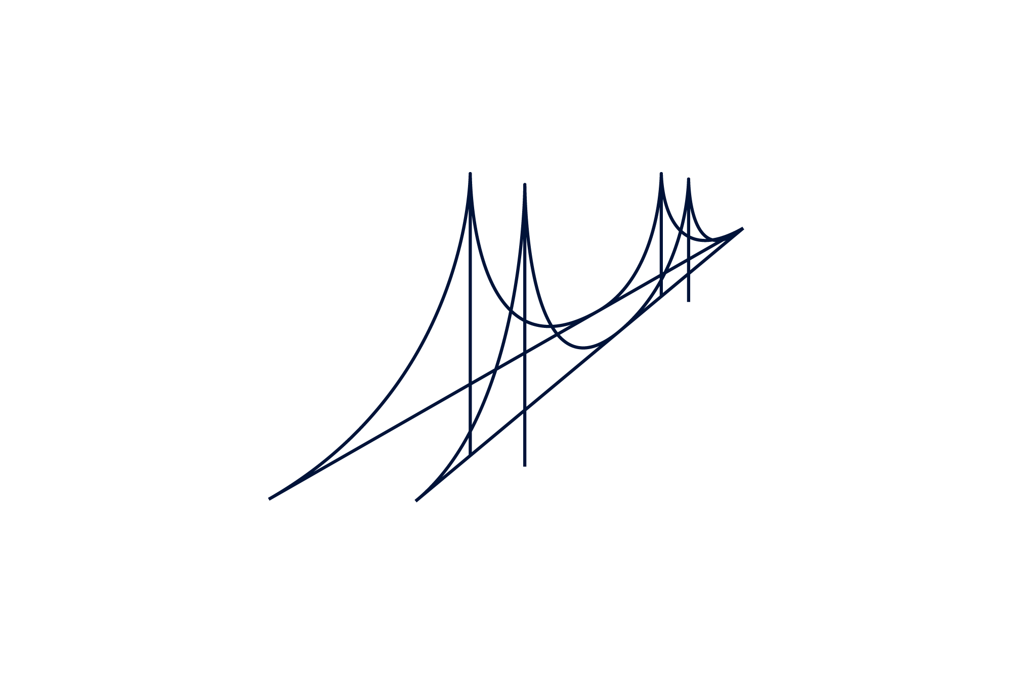
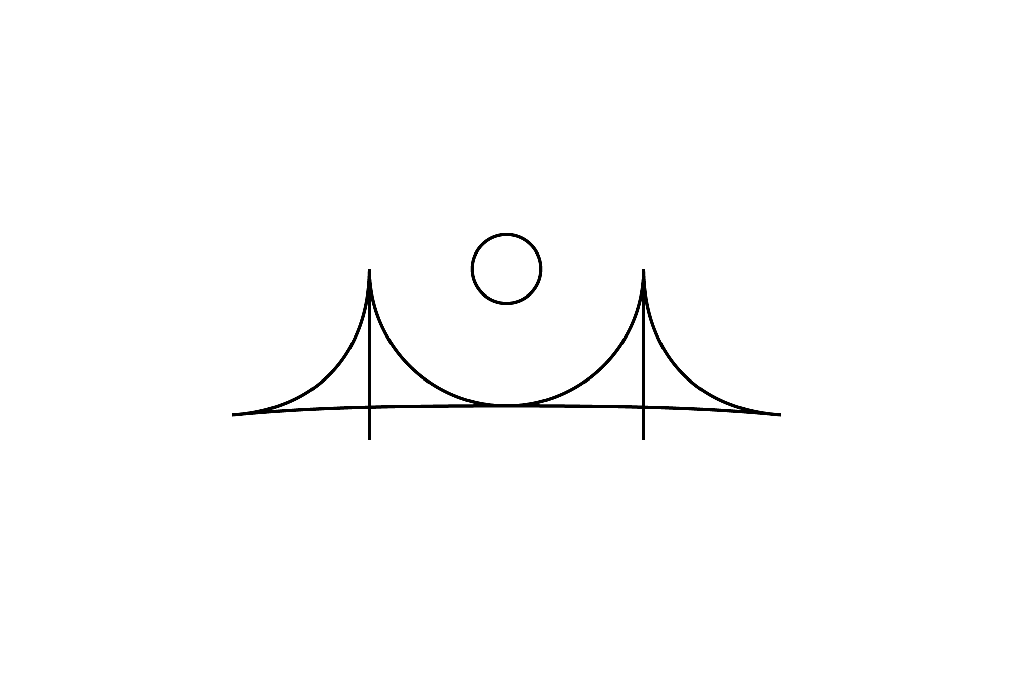
We created further, abstracted logo concepts, based on bridges and sun forms, yet these still felt a little incomplete and uncompelling.
As with every rebrand project we work on, we like to explore all avenues. However, during the creative review process alongside partners, Anthea and Anthony, we kept coming back to the idea of the sunrise over a bridge.
Following these discussions, we focussed on a brand refreshment, a ‘sharpening of swords’, rather than reinventing the wheel.
There was clearly something interesting that adding the sun back to the bridge form has over simply just the bridge, next we refined and refined (and refined some more).
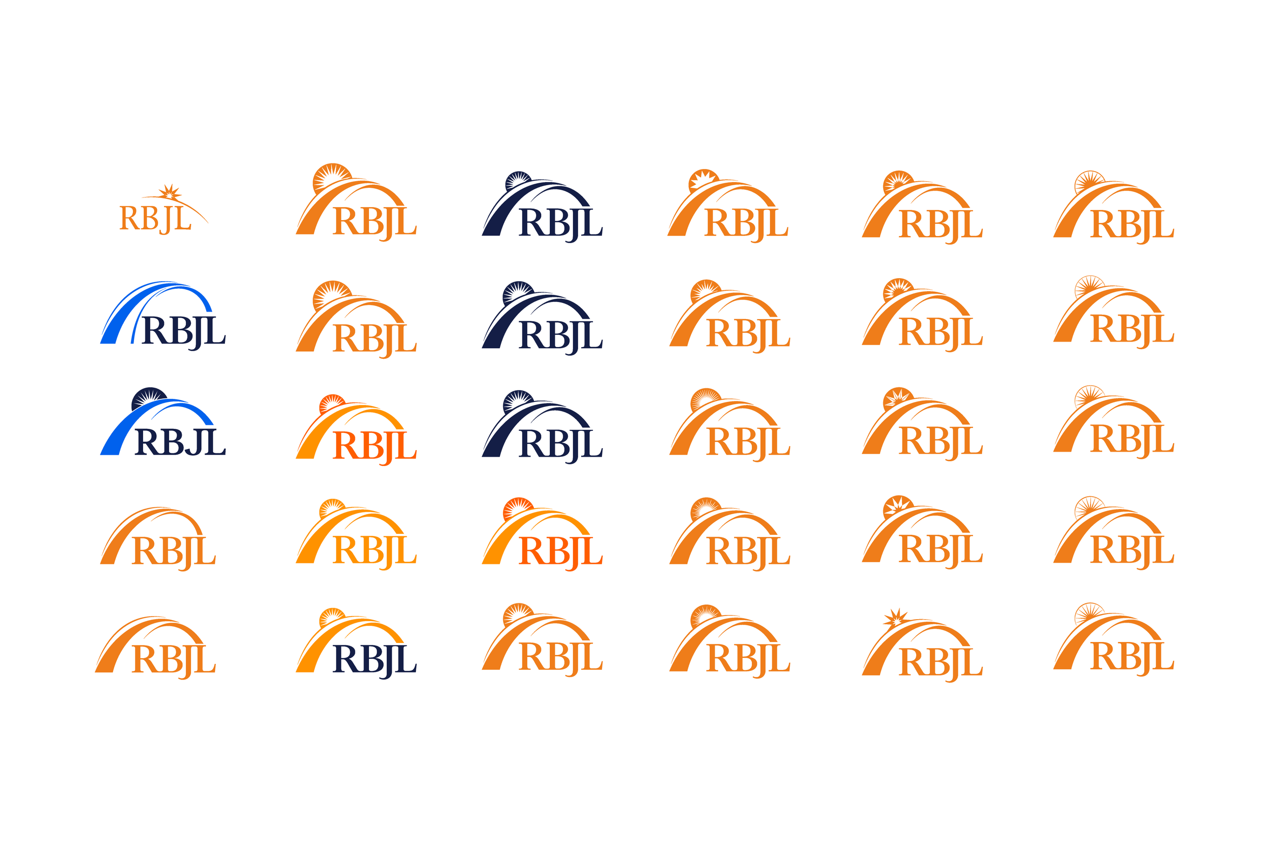
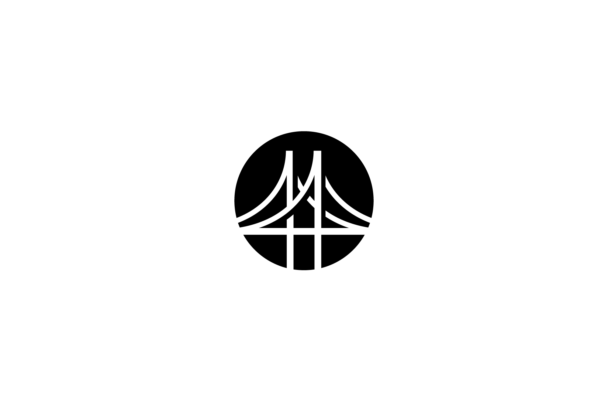
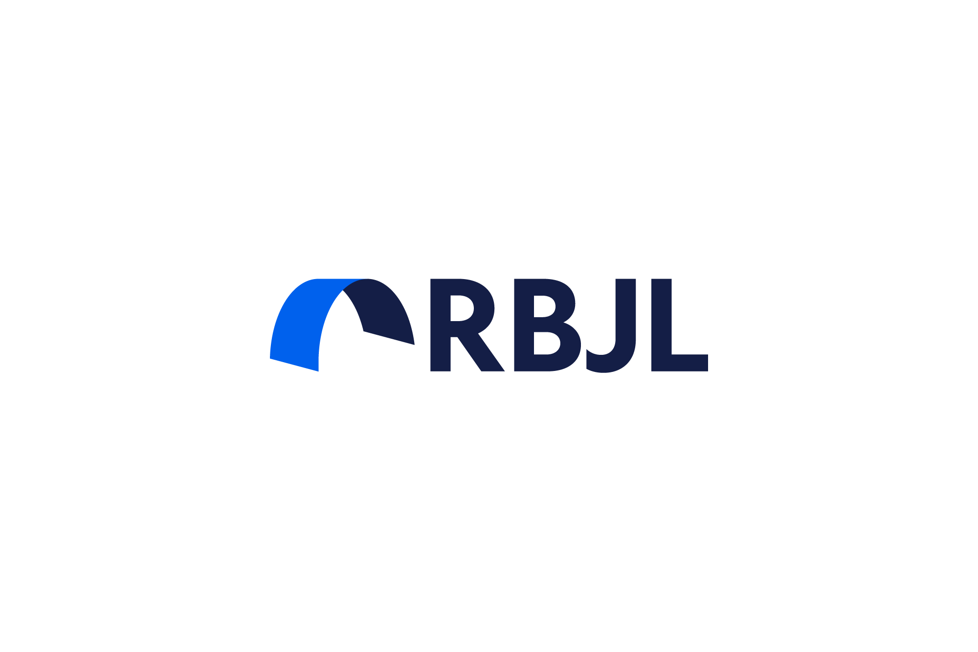
These two slides show how we used the original logo and iterated, abstracted, and refined different possible solutions. We preferred the full arch of the bridge shape, from the text baseline, coming up and over the text, resting on the top of the L. The logo started to have a feeling of completeness and balance.
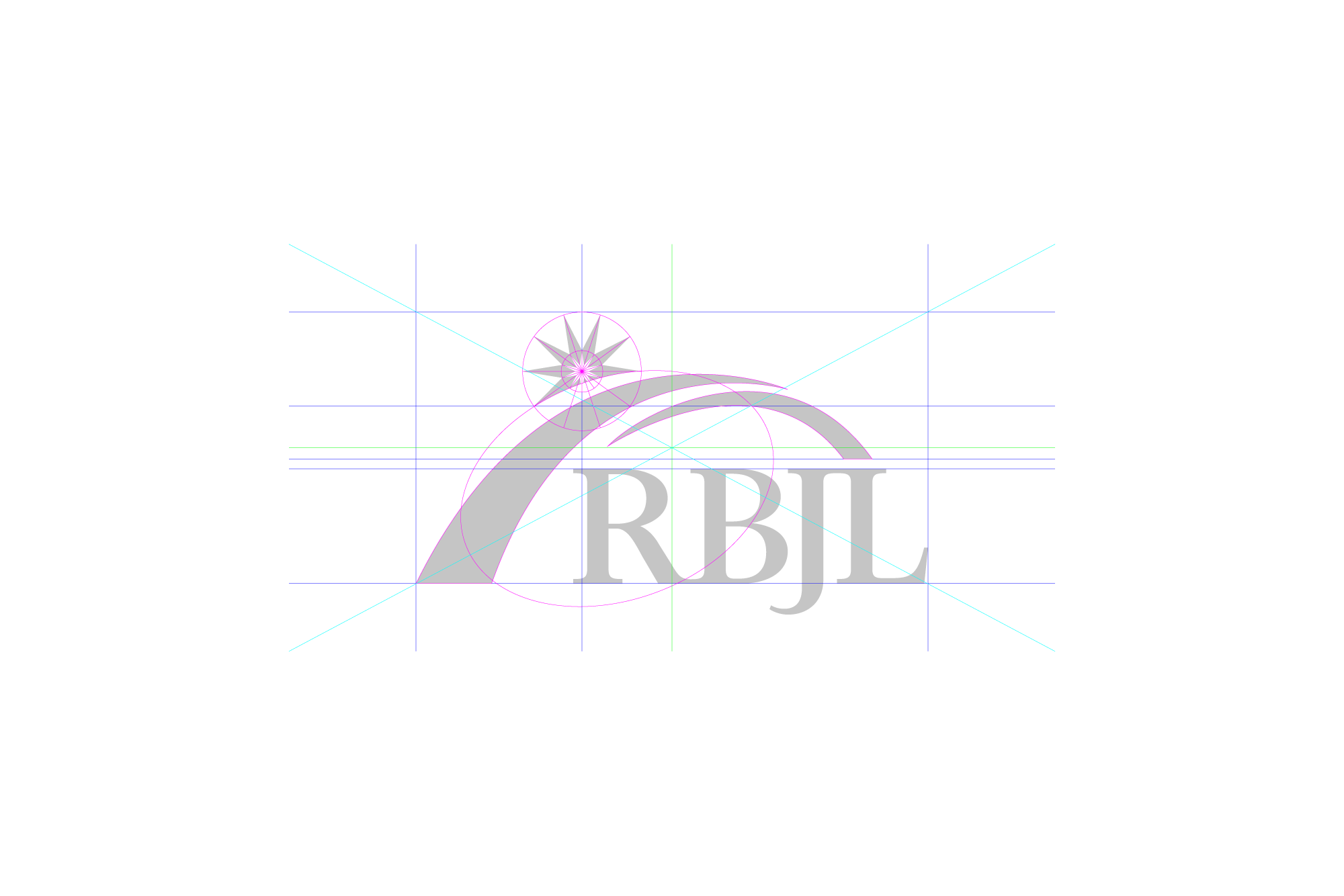
Once we had developed a visually balanced logo with the abstract bridge through, we geometrically corrected the shapes, bought in the logotype and optically balanced the overall mark.
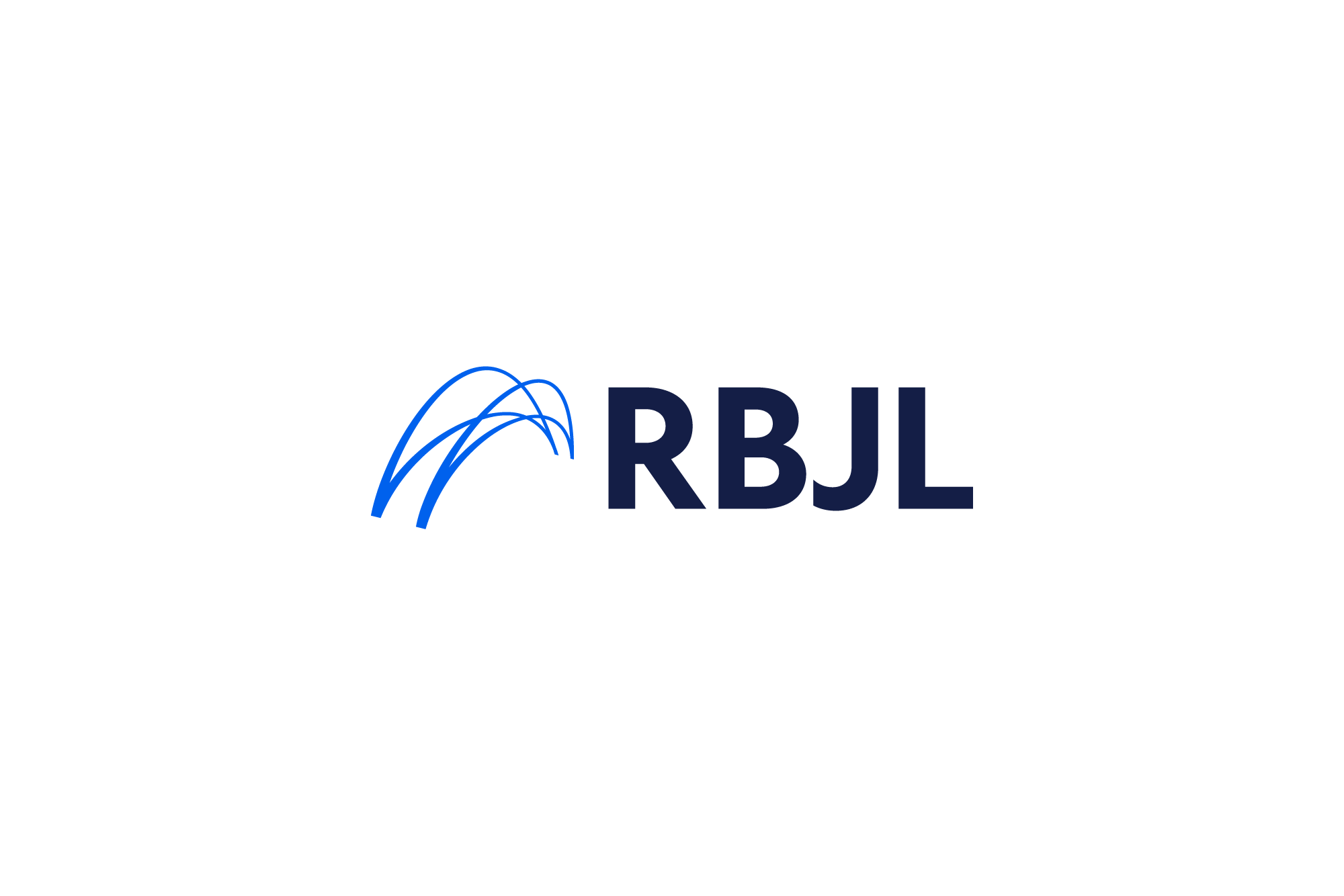
The finalised logo
To get from our original sketches to a critical mark is a process of critical practice. The logo has to do so much, with so little, creating something simple and clean, that encapsulates the brands values, personality is the design challenge we love. It can be enormously, hair-pulling-ly frustrating at times(!), but the reward when we reach a refined and balanced mark makes everything worth it.
Anthea and Anthony were wonderfully engaged in the project, from the beginning of the process to the end. Critical feedback is something that can be hard as its almost the process of putting gut feelings into words, which of course can be enormously difficult. Combining our critical process with a truly open dialogue was the key to making the process a success.
It is always an enormous joy and a responsibility that we take seriously when we’re invited to help an organisation with decades of equity through a rebranding process.
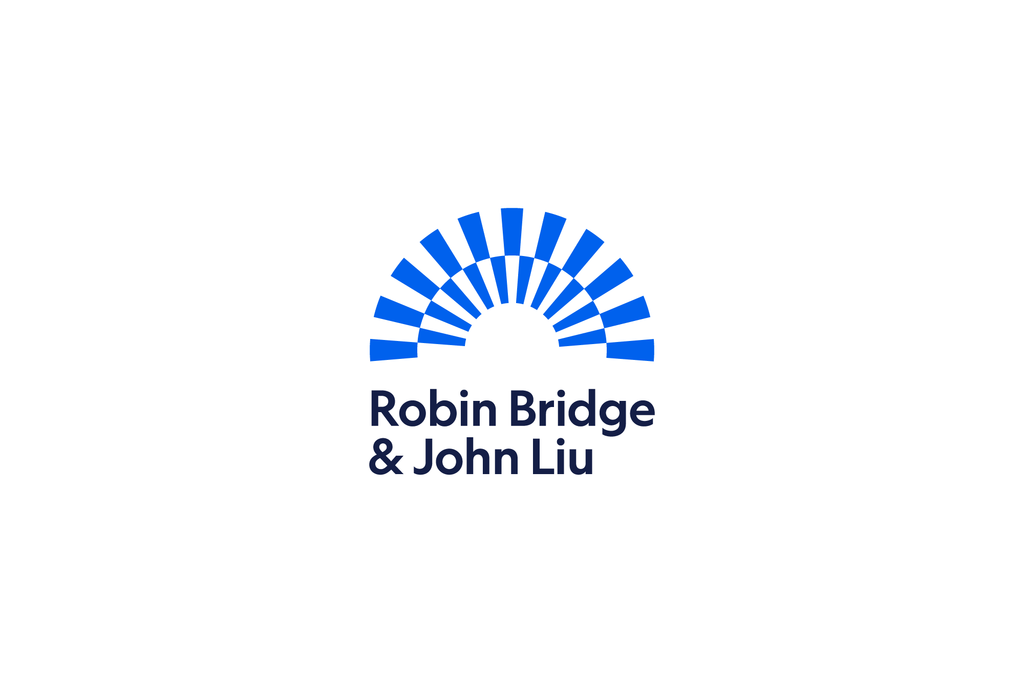
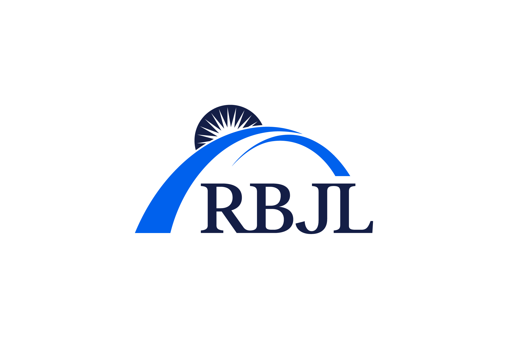
— Finalised logo
The revised logo introduces the abstract bridge, and a forward and upwards motion to the whole mark, encompassing the RBJL logotype whilst retaining the original RBJL rising run.
As with any great logo, its success, and longevity can be fostered through its critical forms, and reduction to the most important parts. As the logo will go on to steward the company into the future, it cannot follow trends and be attached to a period of time, it must be forward-moving, strong and clear. It must feel complete, and be optically balanced.

The typeface, Financers Display Medium from Klim Foundry, was chosen through the design process for its authority. We customised the RB and JL, connecting the original founder’s initials of ‘Robin Bridge’ and ‘John Liu’. This small detail lets the letters sit tighter together and conveys strength and visual completeness.
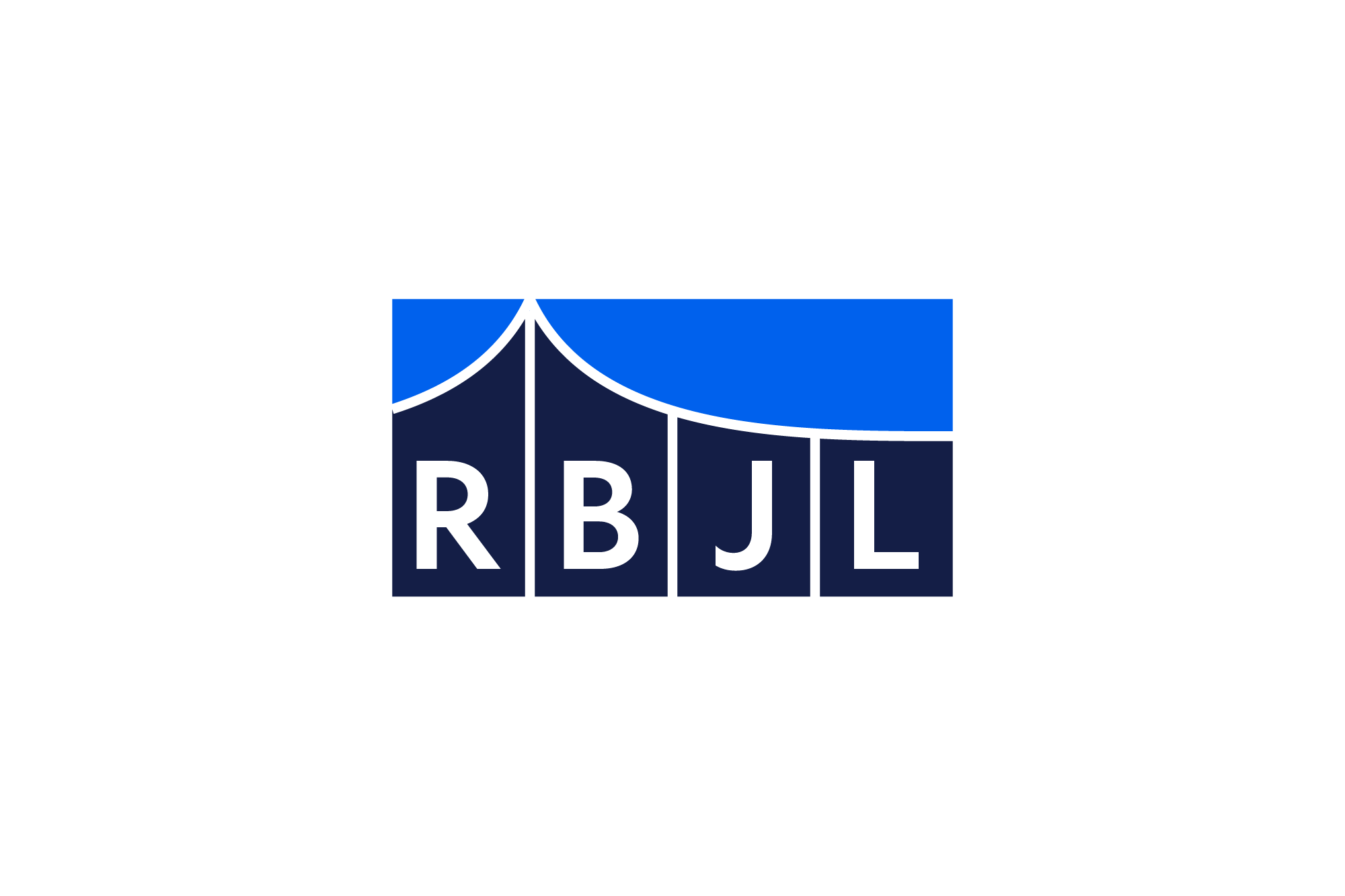
The new brand is protected by consistency. RBJL do not have an internal marketing team, which is common for our clients. We created an easy to reference brand guidelines, with a functional brand system. The brand asset of the arch was a key form to be used in various touchpoints.
RBJL’s original orange was made a little more saturated and has a better contrast against white backgrounds. We chose a complimentary inky deep regal blue for the RBJL logotype, and a light blue as a highlight colour for brand touchpoints.
The moving mark
One of the final steps was creating the moving mark, the animated logo lockup. We decided again, to keep the core values front and centre, with a simple transformation from the full company name, to the logo, to revealing their core values.
This moving mark first thing web viewers will see when entering RBJLs website.
Further reading —
RBJL case study